Leah Huyghe
A builder, designer and researcher in San Francisco who believes design can change humanity.
A builder, designer and researcher in San Francisco who believes design can change humanity.
I'm a Product Designer who leads complex platforms through change: building clarity where systems are messy, teams are scaling, and users need to succeed. My work has centered on creator tools, user education, and novel devices, driving multi-year transformations of legacy systems into modern platforms while balancing business goals, technical constraints, and human needs.
Recently, I've led design for multiple Roblox Studio teams. I'm currently leading Creator Safety, designing systems that detect and prevent child grooming, exploitation, and abuse on a platform with millions of underage users.
Previously, I designed consumer hardware, voice and AI systems at Meta and Samsung.
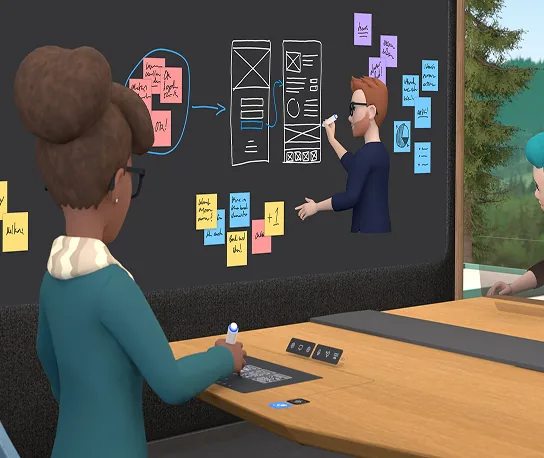
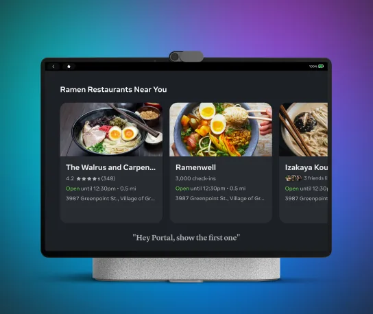
At Meta, I designed both Portal Onboarding & Portal Assistant. This included third-party partnerships with Amazon Alexa, and the integration of Facebook Assistant. I also led the Microsoft VR partnership for MetaWorks on Meta Quest, the flagship VR headset.
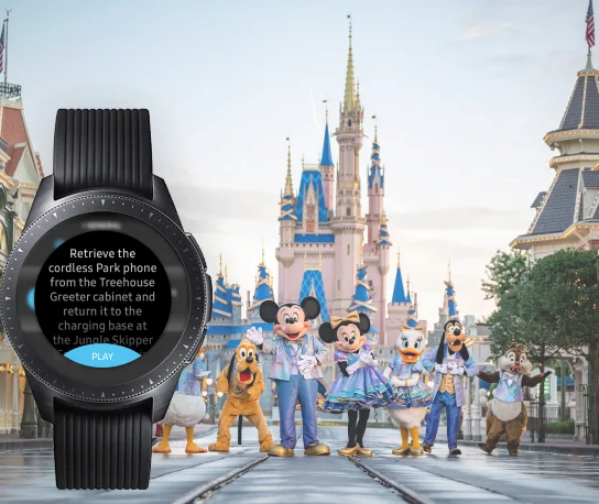
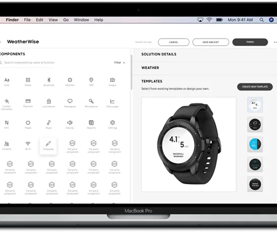
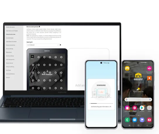
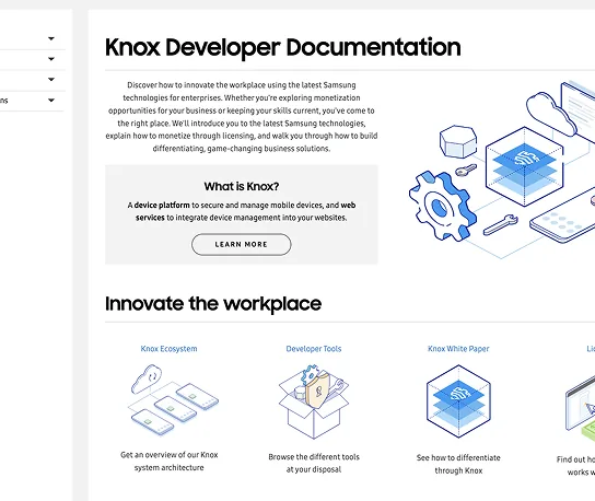
At Samsung Canada, I designed enterprise wearable systems used by thousands of organizations worldwide, building systems that operate reliably at massive scale. This included various Knox solutions for the Galaxy Watch. My favorite clients to partner with were the FBI and Disney.
Alongside the product work, I've mentored four associate designers and managed three interns, with a focus on craft development, building confidence, and navigating organizational complexity.
I'm known for steady leadership, mentoring associates and managing interns, creating culture where designers do their best work. I'm most interested in principal IC roles with a designer-manager hybrid shape: deep product ownership, high craft standards, and direct investment in the people around me.
Outside of design, I offer pro-bono consulting to founders who are solving chronic illness and the American healthcare system. I also sit on the board of Rose Charities Canada, advising Vision Together Nepal.
Prior to tech, my previous career was in the French Culinary Arts. I was a Sous Chef in Vancouver, Canada, and still enjoy cooking today.

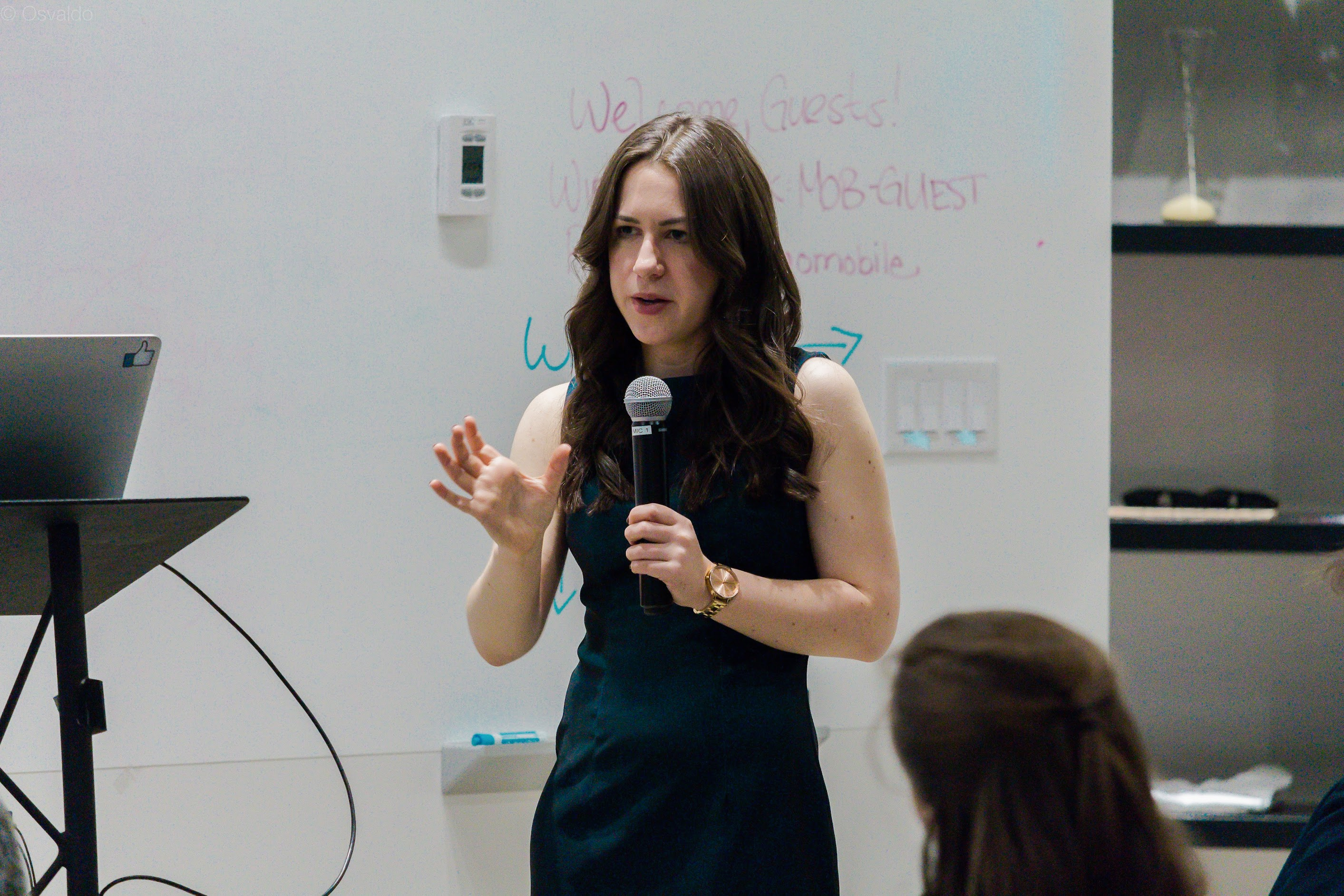
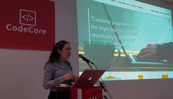
"I consider Leah to be one of the most valuable designers at Roblox."

"Leah gets stuff done. She has always been highly responsive to new tasks and requests, always going above and beyond with attention to detail."

"The fidelity of her designs makes idea communication seamless. She has made my life as a Product Manager far easier. Would happily work with her again."

"Her openness to feedback and ease in collaborating across disciplines makes her a valued teammate. I've genuinely enjoyed working with her."

"Leah has been such a phenomenal mentor. She is immensely dedicated and passionate about her role. Since I started at the company, she has helped me (and several other new graduates) work through challenging team-matching decisions, advocate for opportunities, and strengthen our craft with tactical advice, honest assessments, and thoughtful guidance. I always admire the quality, sharpness, and impact of everything she produces. I'm so excited to continue learning from her breadth of experience."

"Leah is an incredible mentor whose guidance has been instrumental in my professional development. Her support during design exercises, design reviews, and stakeholder conflicts has helped me find my voice and gain renewed confidence as a designer. Leah's greatest strength is her ability to simultaneously grow others while delivering exceptional work herself. Her feedback is consistently clear, actionable, and specific, focusing on design trade-offs and surfacing blind spots in my work. She truly believes in the potential of those she mentors, providing the psychological safety and technical guidance necessary to navigate my role with confidence. Her commitment to fostering design excellence makes her an invaluable asset to any team."

To explore my work more deeply, start here.
Something exciting coming soon
Something exciting coming soon
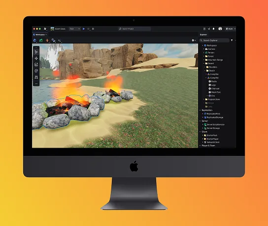
In three years, I led four distinct projects at Studio, the creation platform at the center of one of the world's largest user-generated content ecosystems. When I joined in February 2023 to lead New User Education, Studio was a professional-grade tool with no onboarding path and a 1990s-era interface. The four projects below span two distinct problem spaces: product craft and new creator education on one side, safety-critical systems design on the other.
Across Creator Safety, Onboarding Tour, and Studio Start Page, I was the design lead responsible for end-to-end product design. I led cross-functional work with several engineers, multiple PMs, a data scientist, and content design partners, shaping the product direction from ambiguous problem spaces through launch-ready experiences.
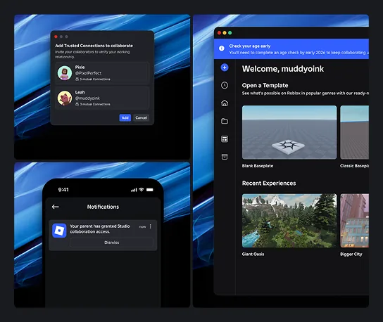
Creator Safety addresses Roblox Studio's highest-stakes safety challenges while preserving the creative accessibility that makes the platform work for first-time creators and professional teams. The work responded to increased external scrutiny, including Bloomberg's investigation into safety concerns and NPR's coverage of platform safety measures.
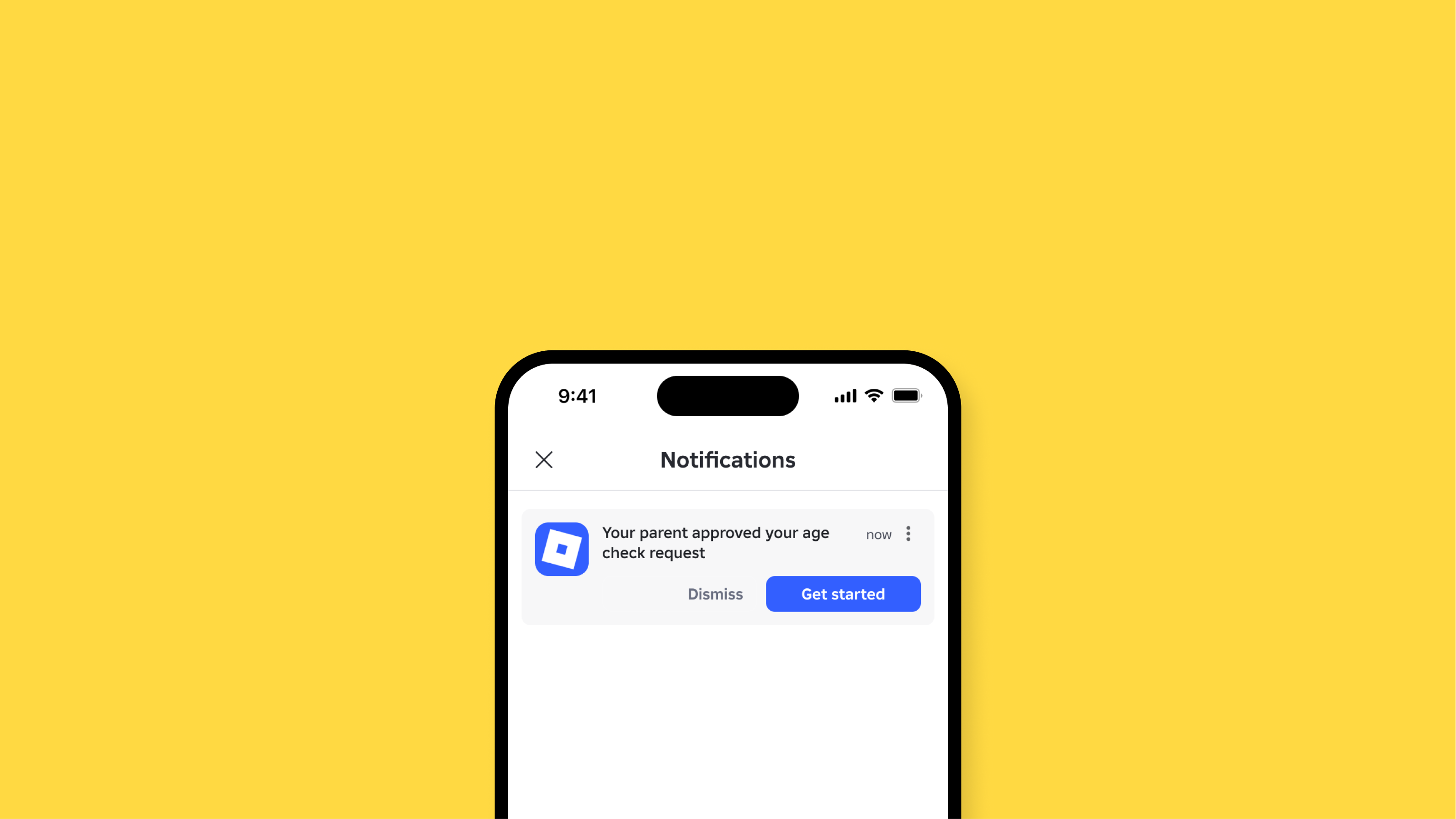
The rollout restructured how Studio creators approach age-appropriate collaboration and content. Working closely with Account Trust & Safety, Legal, and Policy, I translated regulatory requirements into creator-facing patterns for age verification, trusted relationship verification, content maturity labels, and policy guidance. The goal was to make compliance feel like clarity rather than friction, with safety decisions embedded directly into the publishing flow.
The impact showed up in adoption metrics and external validation. Studio's collaboration tools support thousands of professional game development teams, while the safety infrastructure earned acknowledgment from organizations like the Family Online Safety Institute.
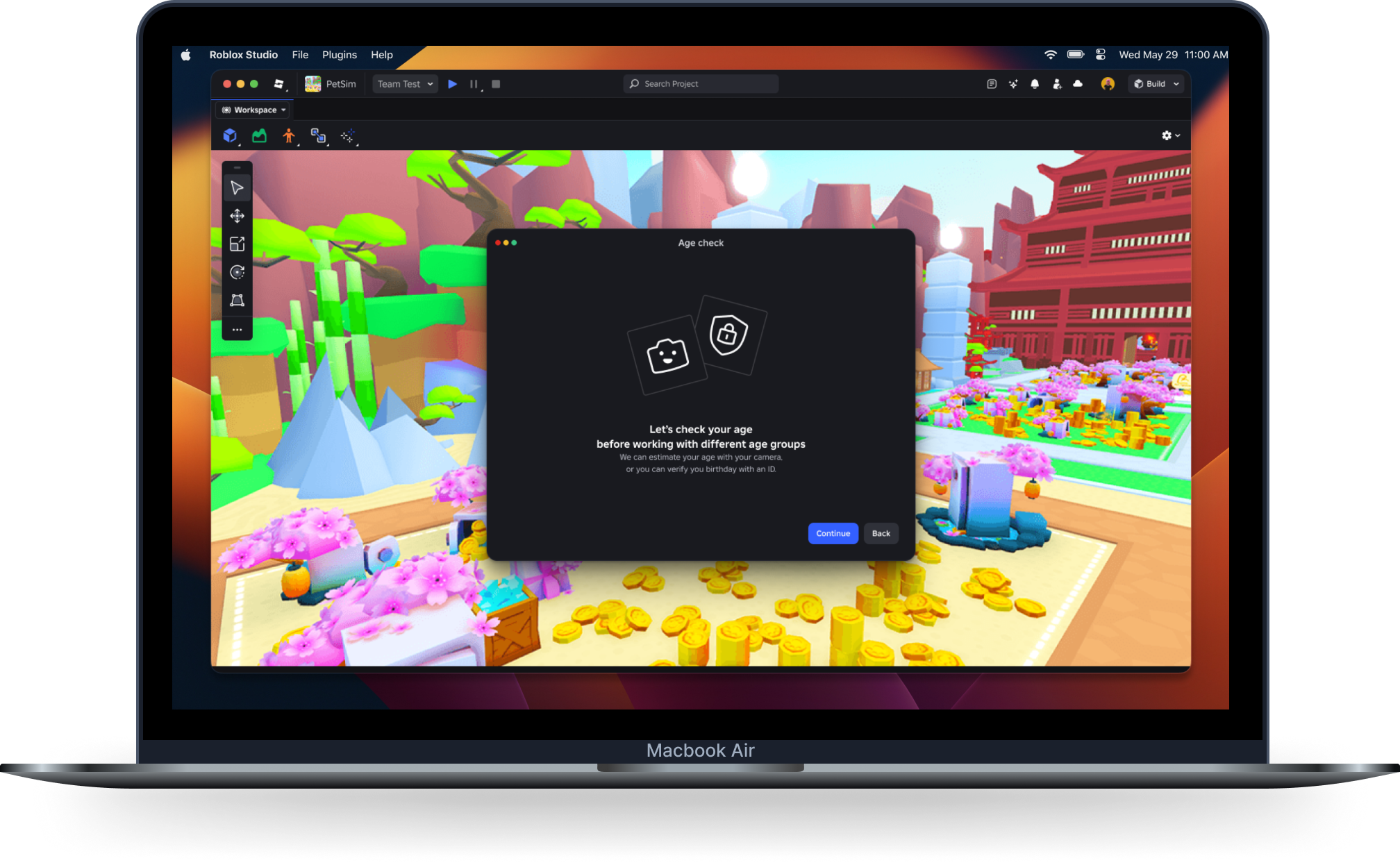
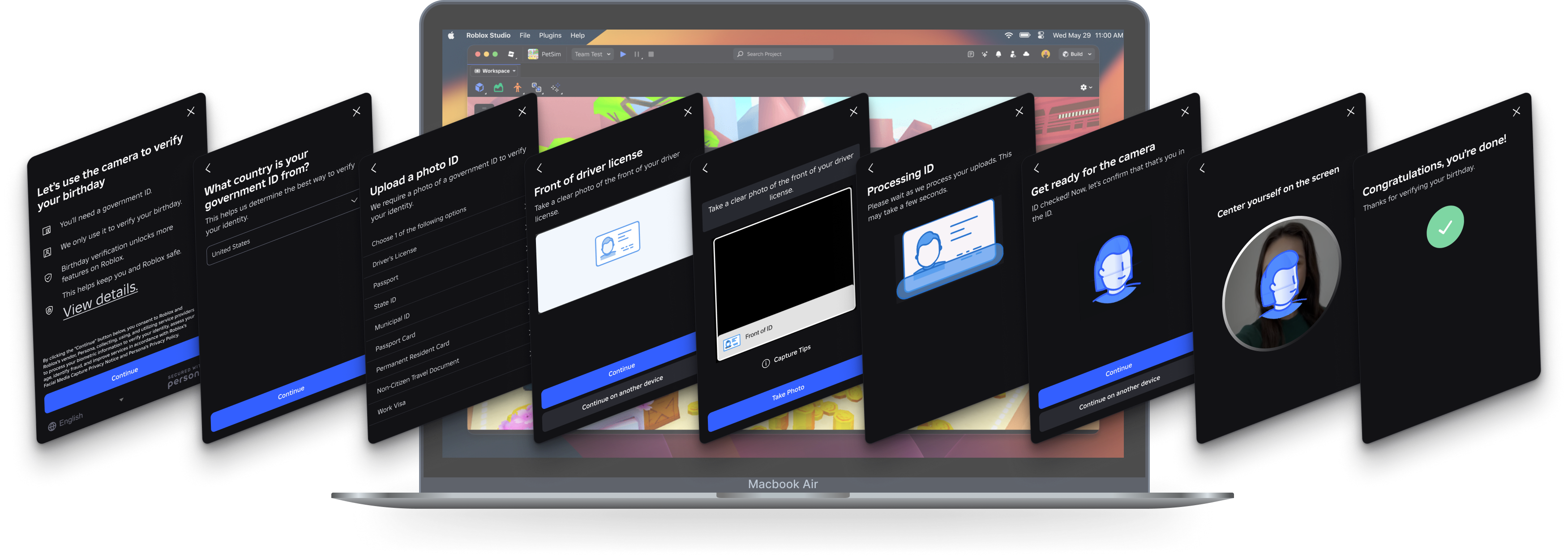
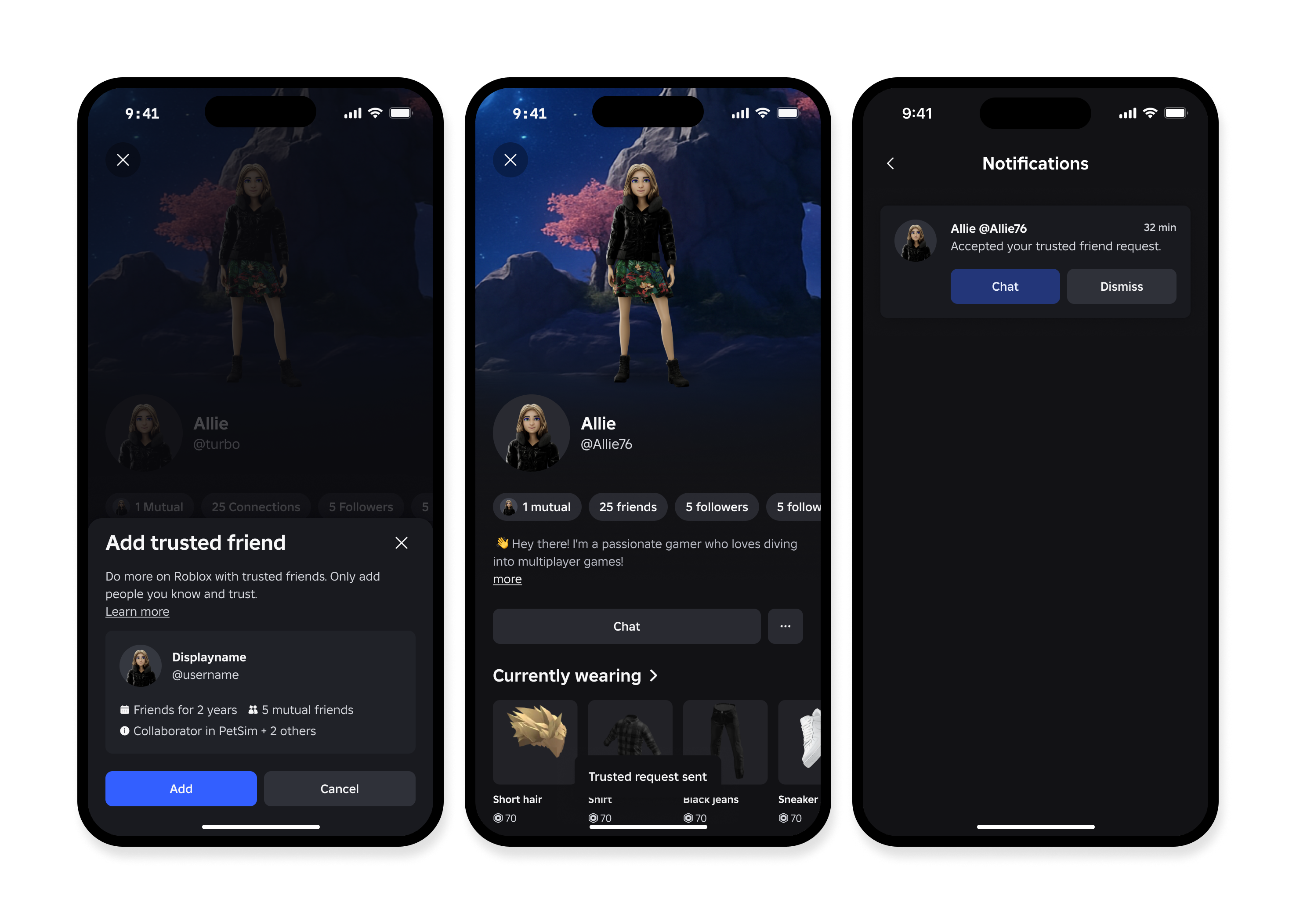
Trusted Friends verified that cross-age collaborators already knew each other off-platform. Creators could generate a unique link and share it externally to confirm a pre-existing relationship, with parental consent required for users under 13.
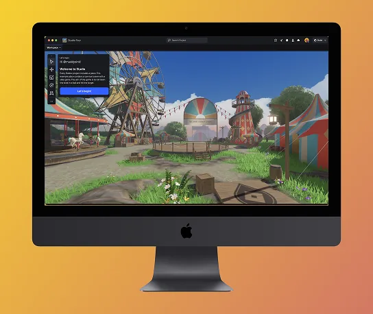
The core problem was drop-off. For years, aspiring creators hit the same wall: install Studio, face hundreds of unlabeled panels and tools, feel overwhelmed, and close the application before building anything. Studio was a professional creation environment that made no concessions for newcomers.
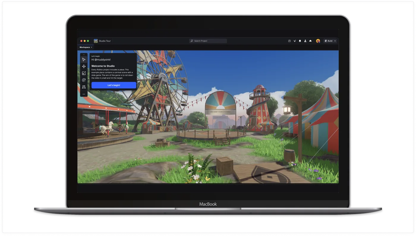
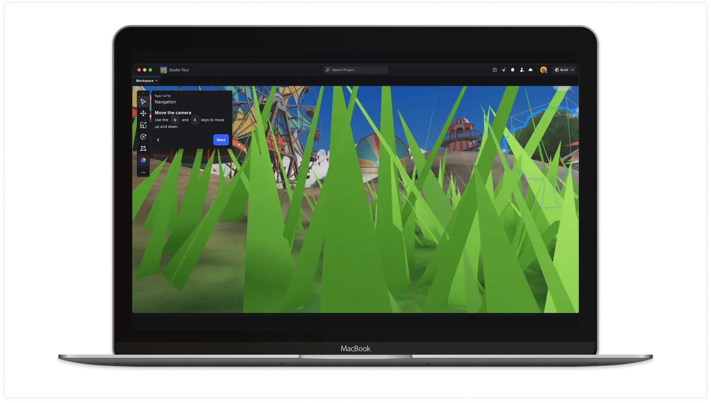
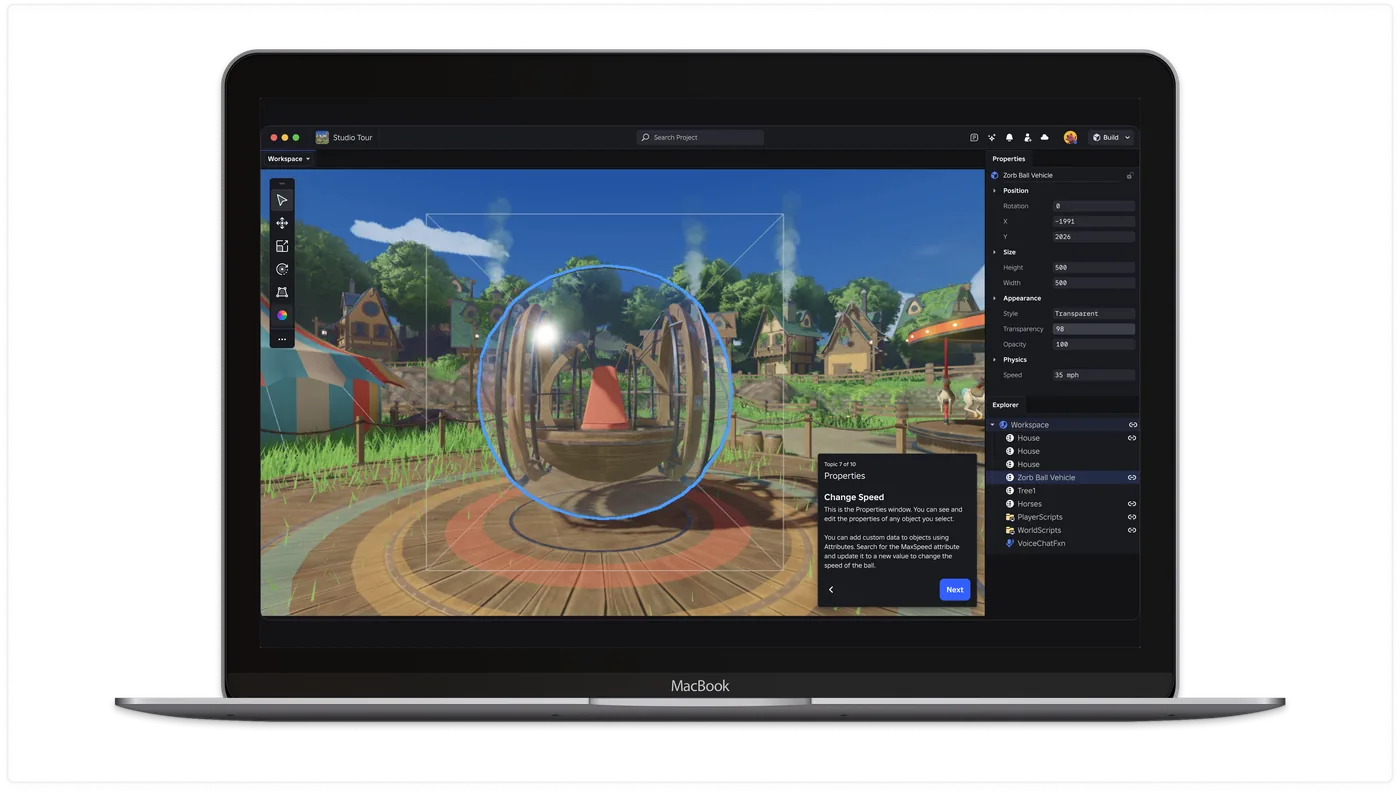
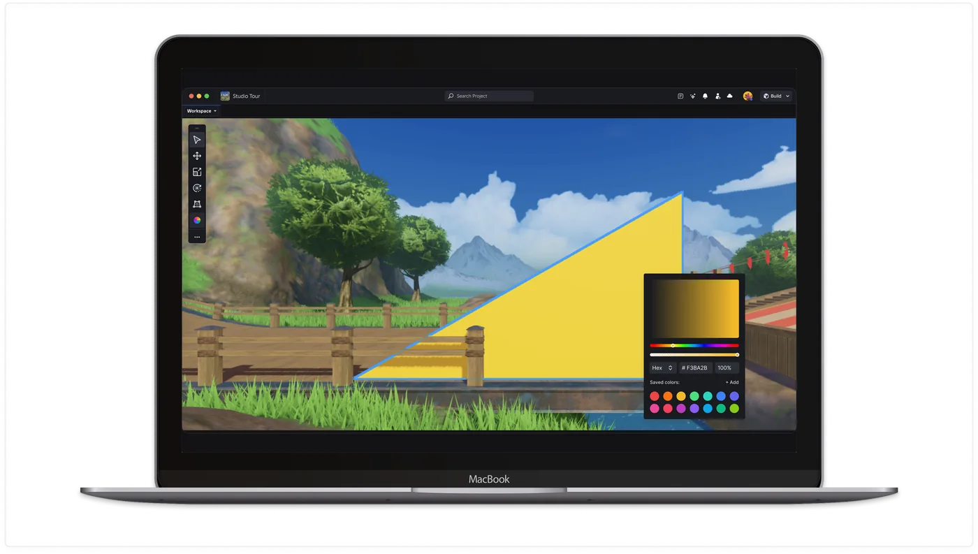
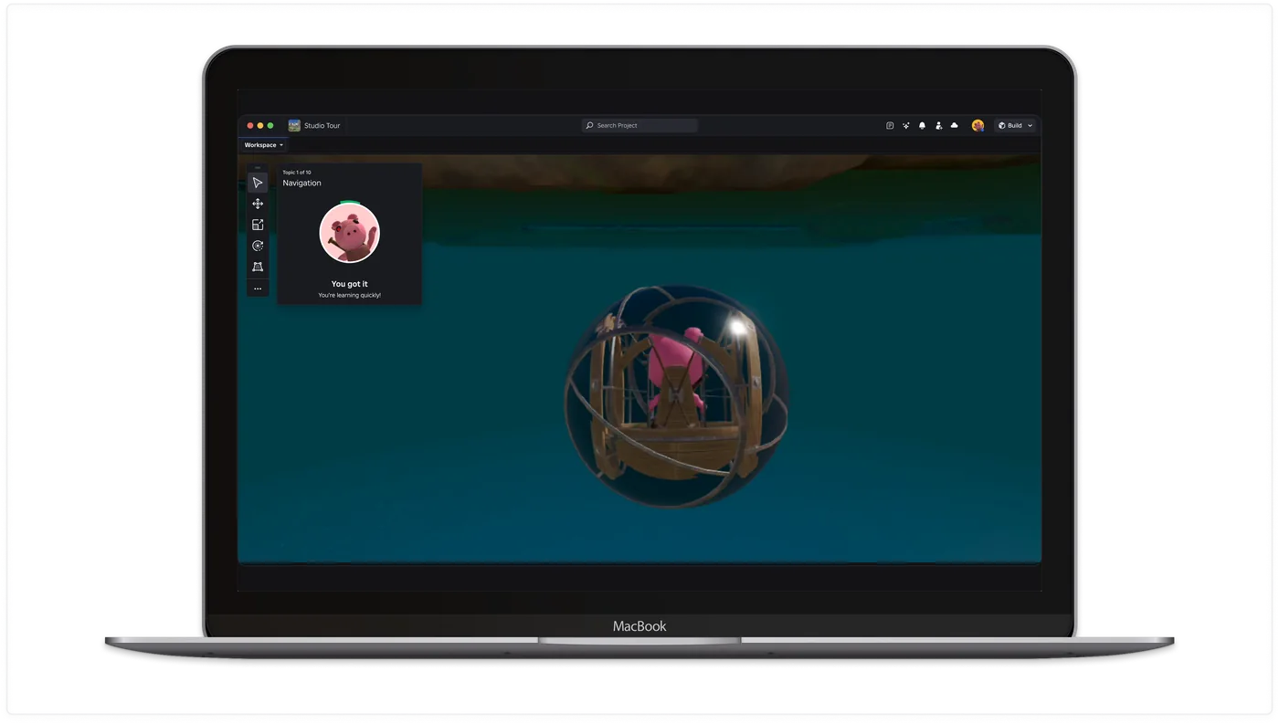
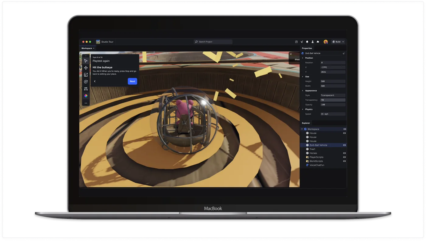
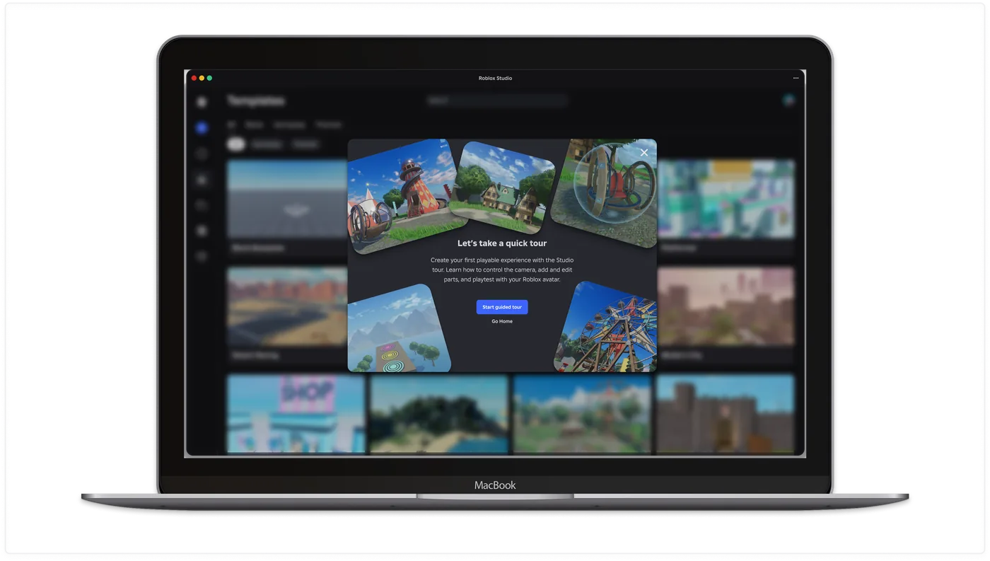
Onboarding Tour was the answer: a 10-lesson interactive experience embedded inside the real product, designed to make that first open an active learning moment rather than an abandonment point. I led the end-to-end design and partnered with a 3D artist to build the carnival-themed place, using the environment itself as part of the teaching system.
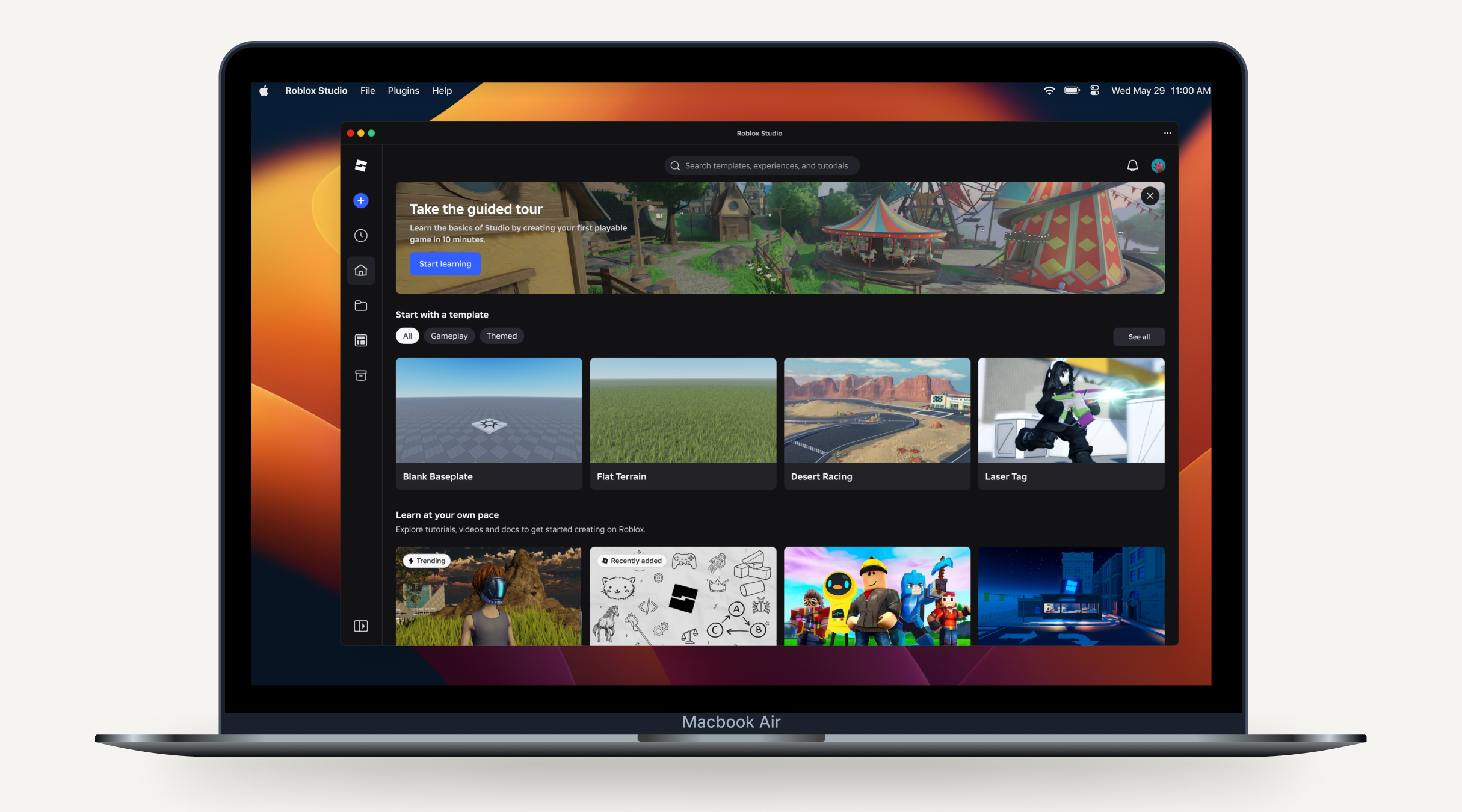
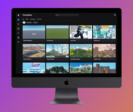
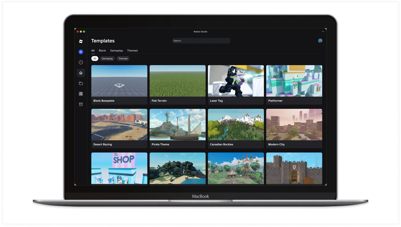
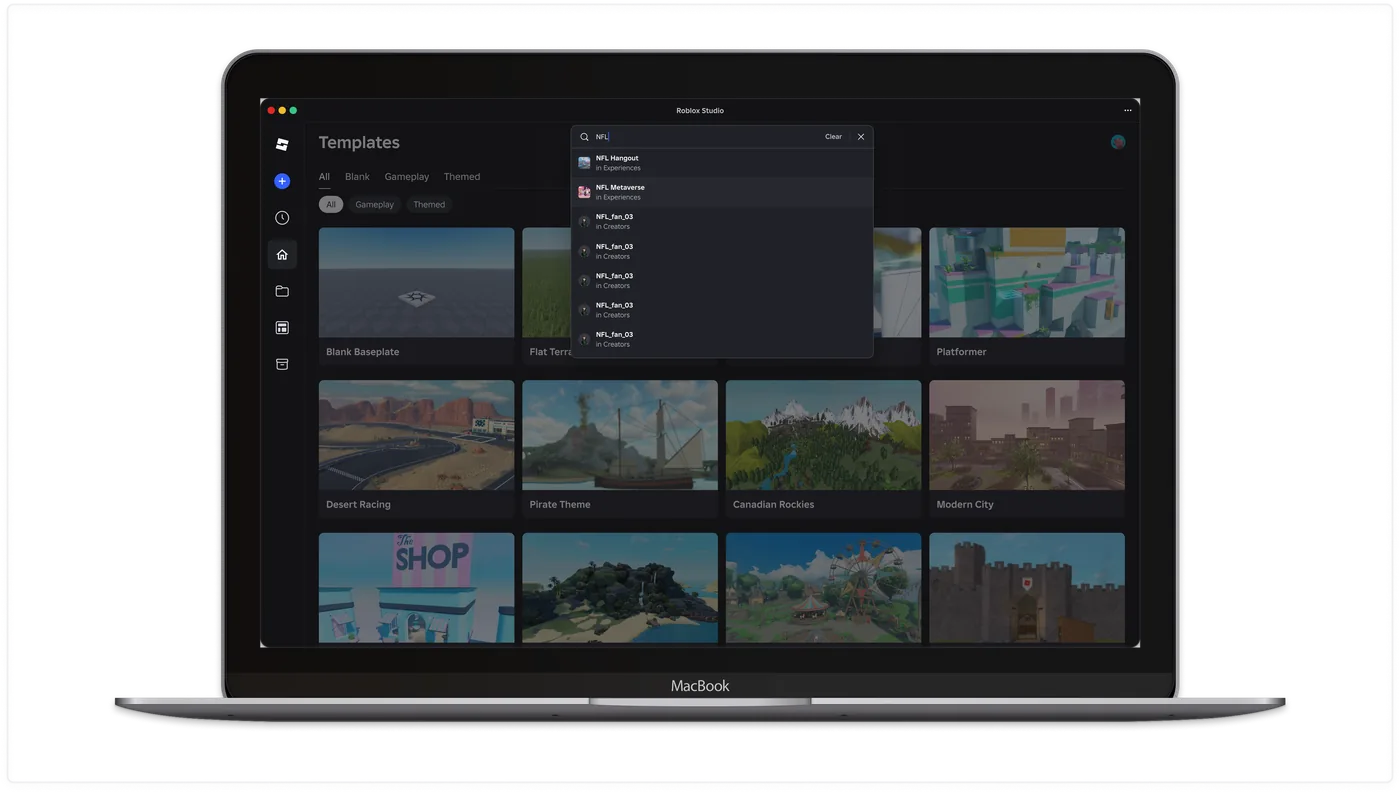
I led the end-to-end redesign of Studio's start page, launched in October 2024, replacing outdated UI frameworks that caused persistent performance issues and hangs. The new interface streamlines creator workflows with improved loading times, dedicated recents tabs, and Team Create status visibility. This foundational work enables faster iteration on safety features by modernizing the technical infrastructure that supports millions of daily creators.
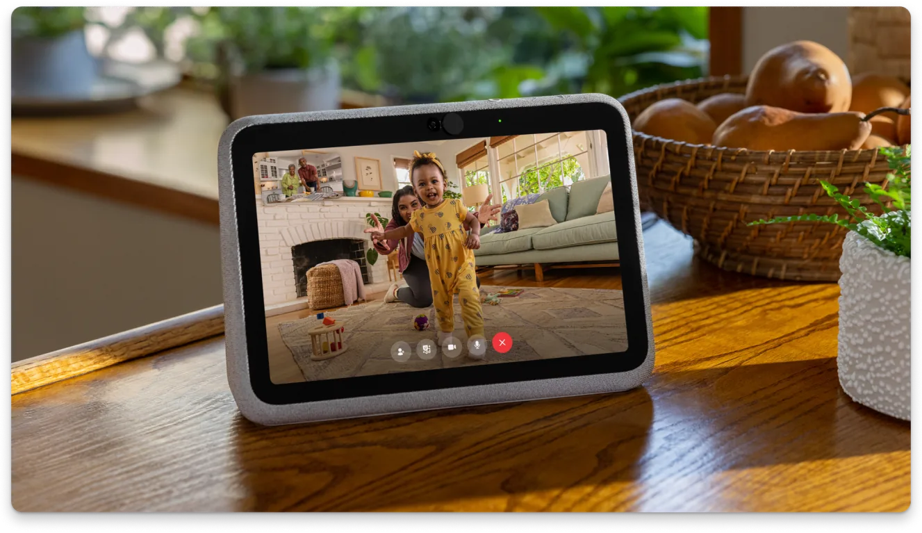
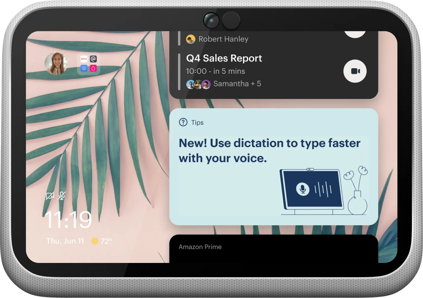
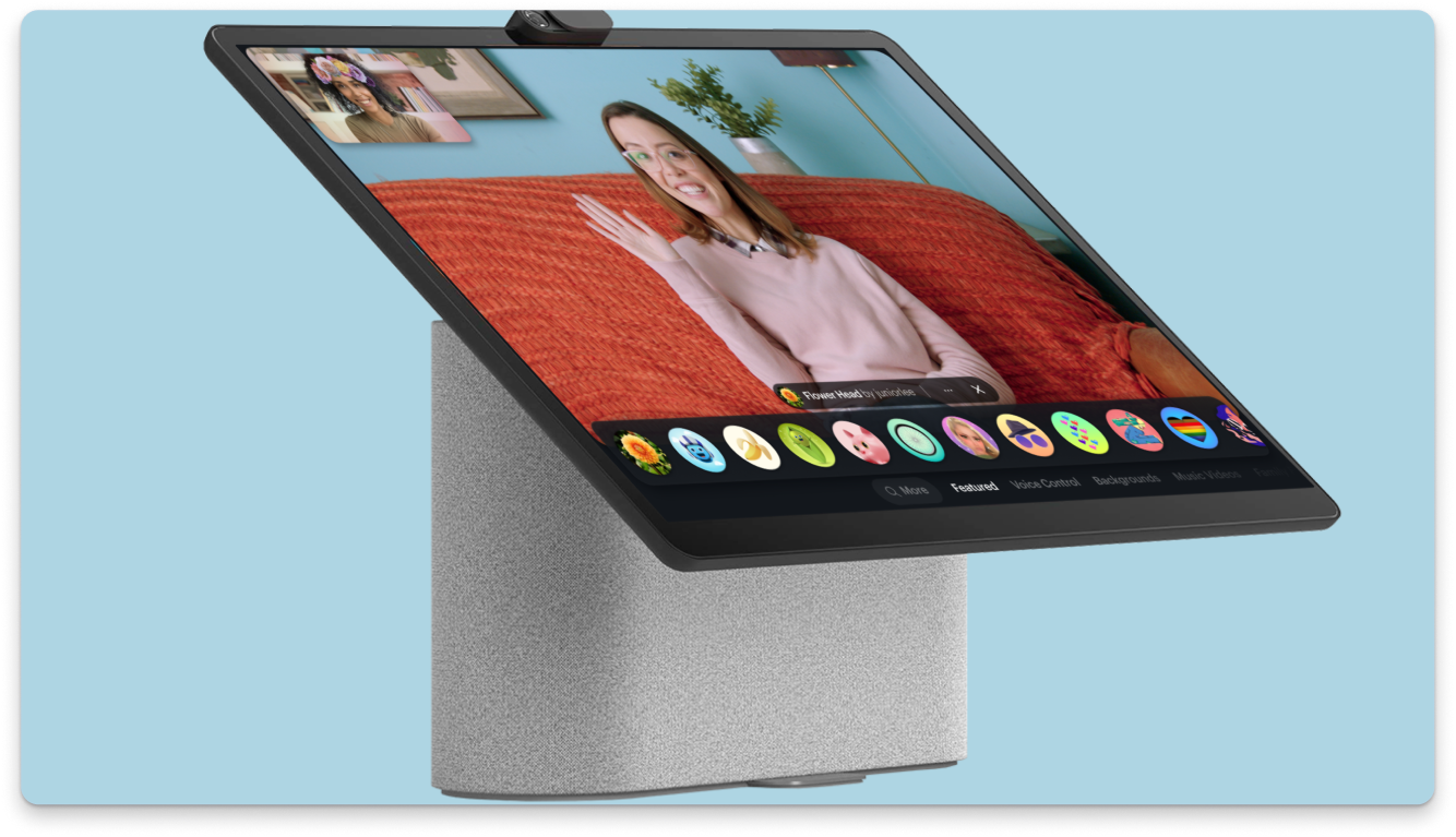
From 2019 to 2023, I designed across the full stack of Portal experiences, with my strongest ownership in the out-of-box experience: the first-touch setup, boot-up, and onboarding flows that shaped how people understood the device from the moment it powered on. That foundation needed to make a new product category feel legible, personal, and trustworthy before users had formed any mental model for it.
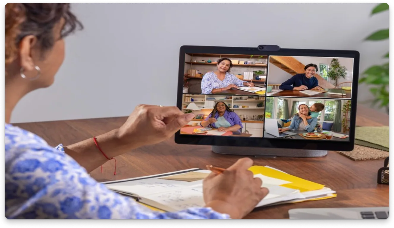
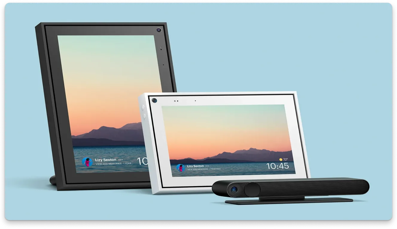
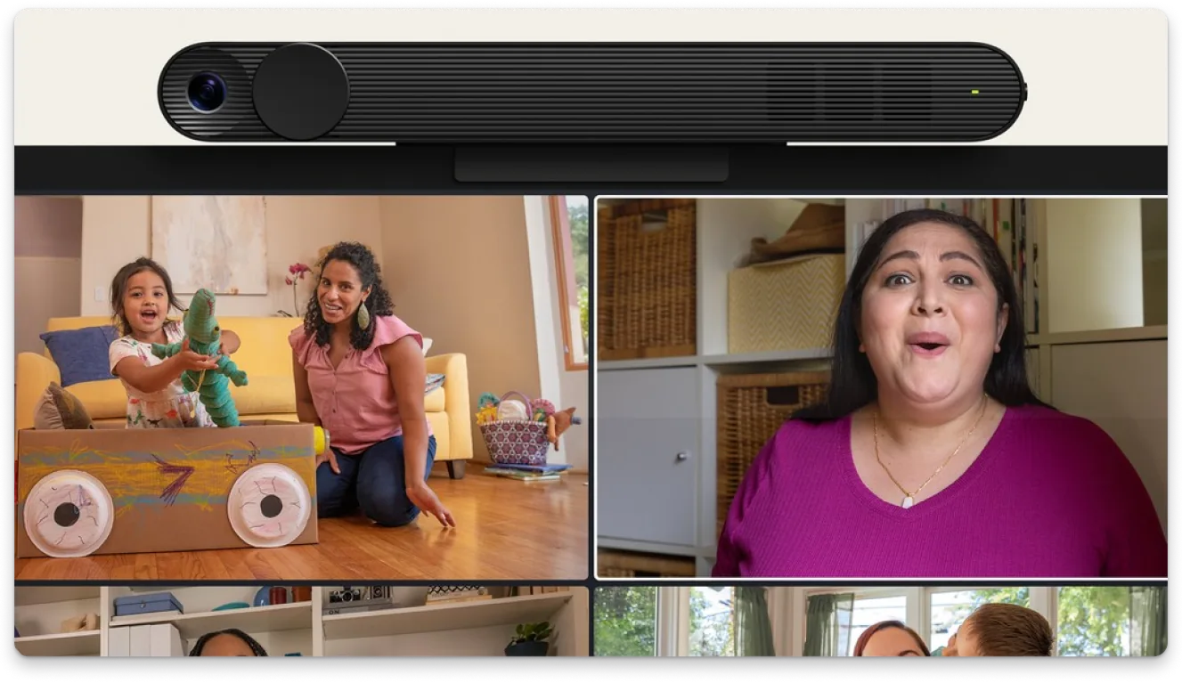
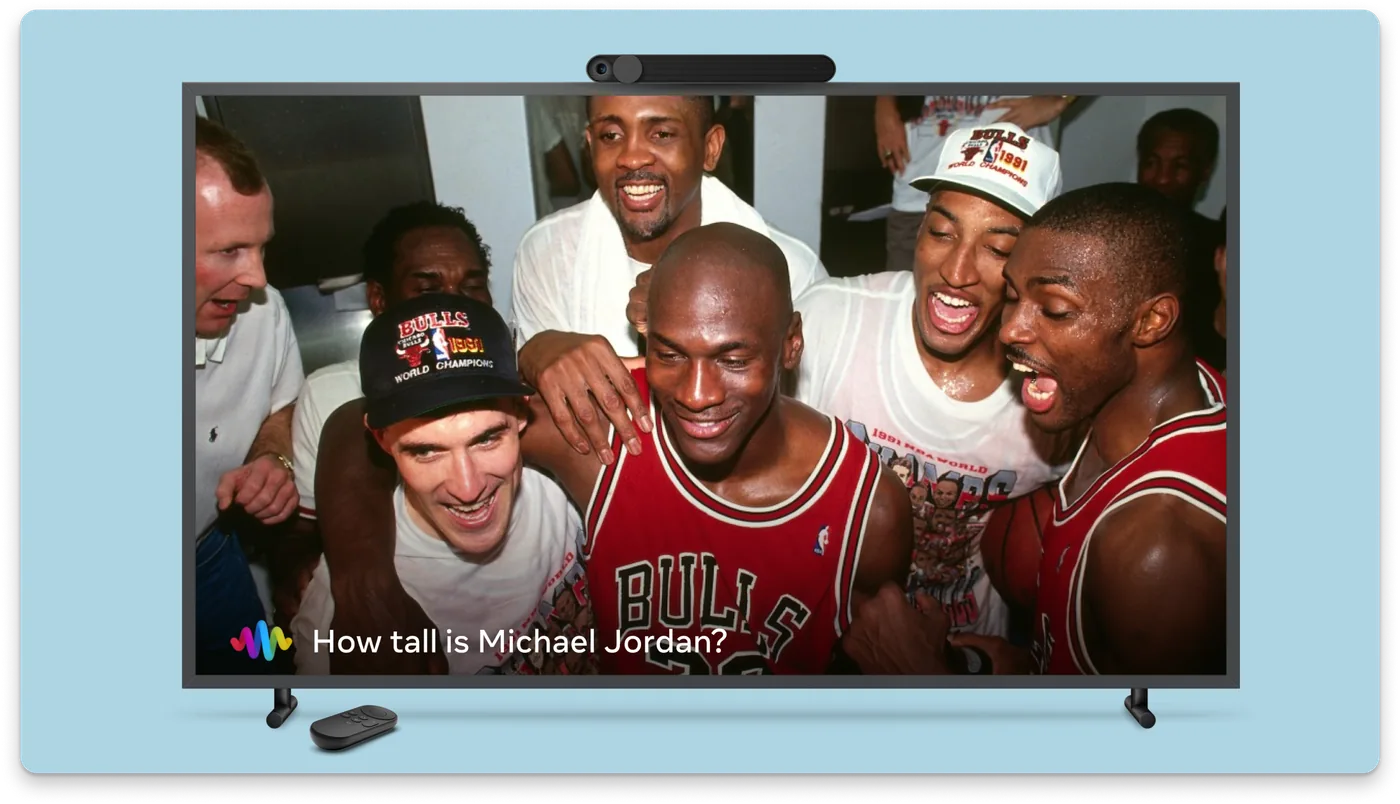
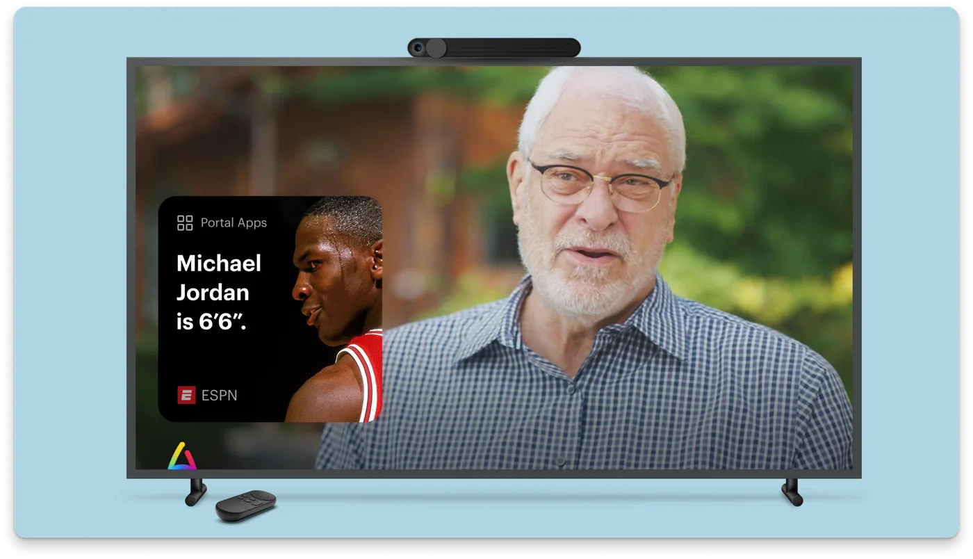
Portal was a unique design challenge: a shared household device with two competing voice assistants, deep social graph integration, and a persona ("the smart houseguest") that required restraint as much as capability. I worked directly with Amazon to balance Meta Assistant and Alexa on a single platform, and shaped Portal TV as a distinct product category designed for the living room.
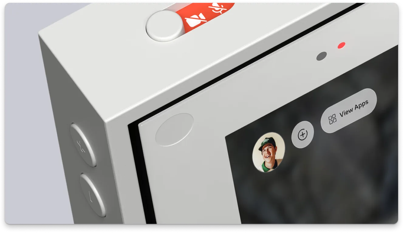
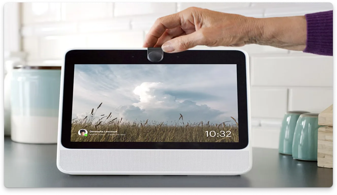
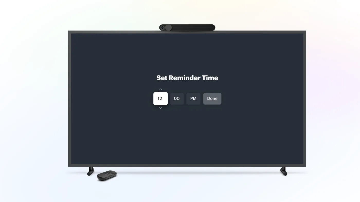
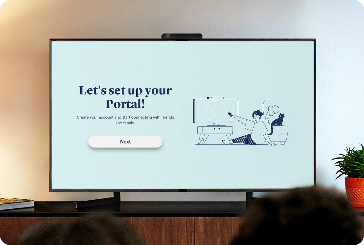
The out-of-box experience is the clearest representation of my Portal work. I designed the complete first-touch setup for both Portal TV and Portal Touch (internally known as Portal Mini and Portal Go), transforming complex multi-step hardware setup into guided, approachable onboarding flows. Each device had a distinct interaction model — Portal TV lived in the living room, controlled by remote; Portal Touch was a handheld touchscreen device. The challenge was creating flows that felt native to each context while sharing a coherent setup language across the product family.
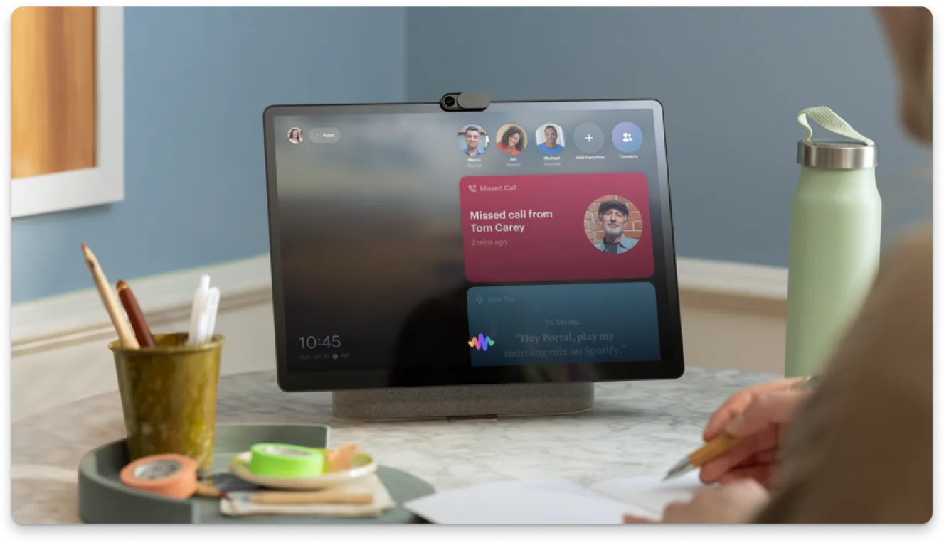
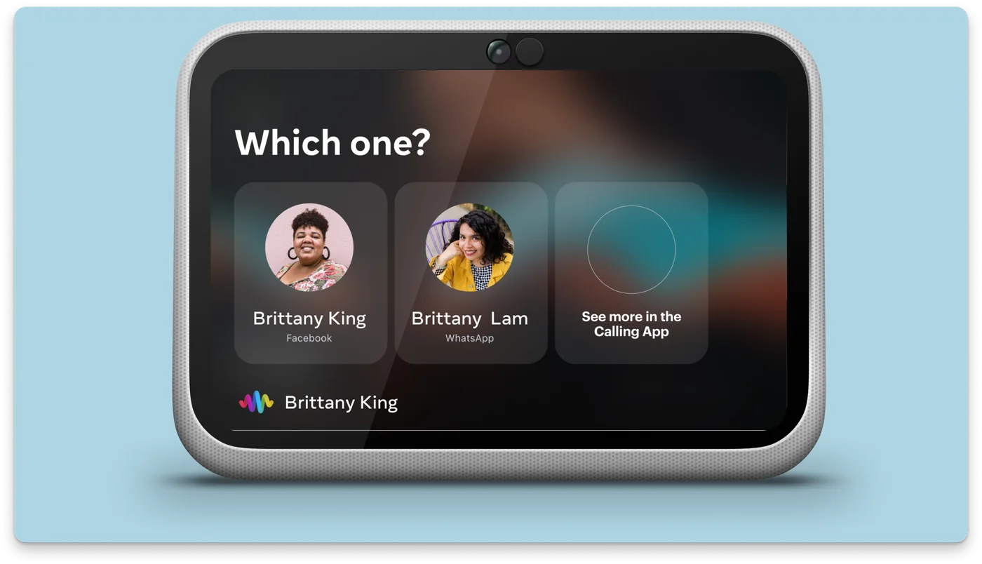
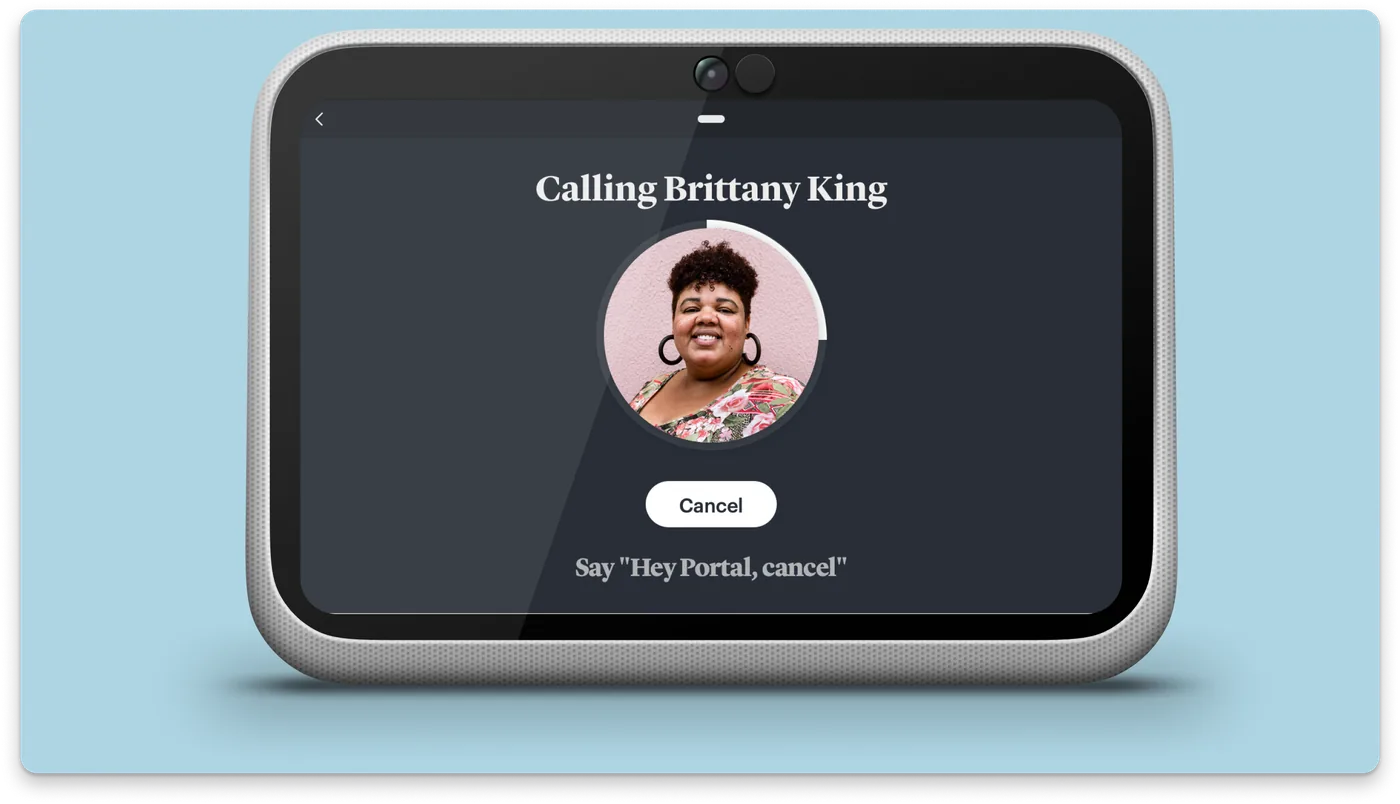
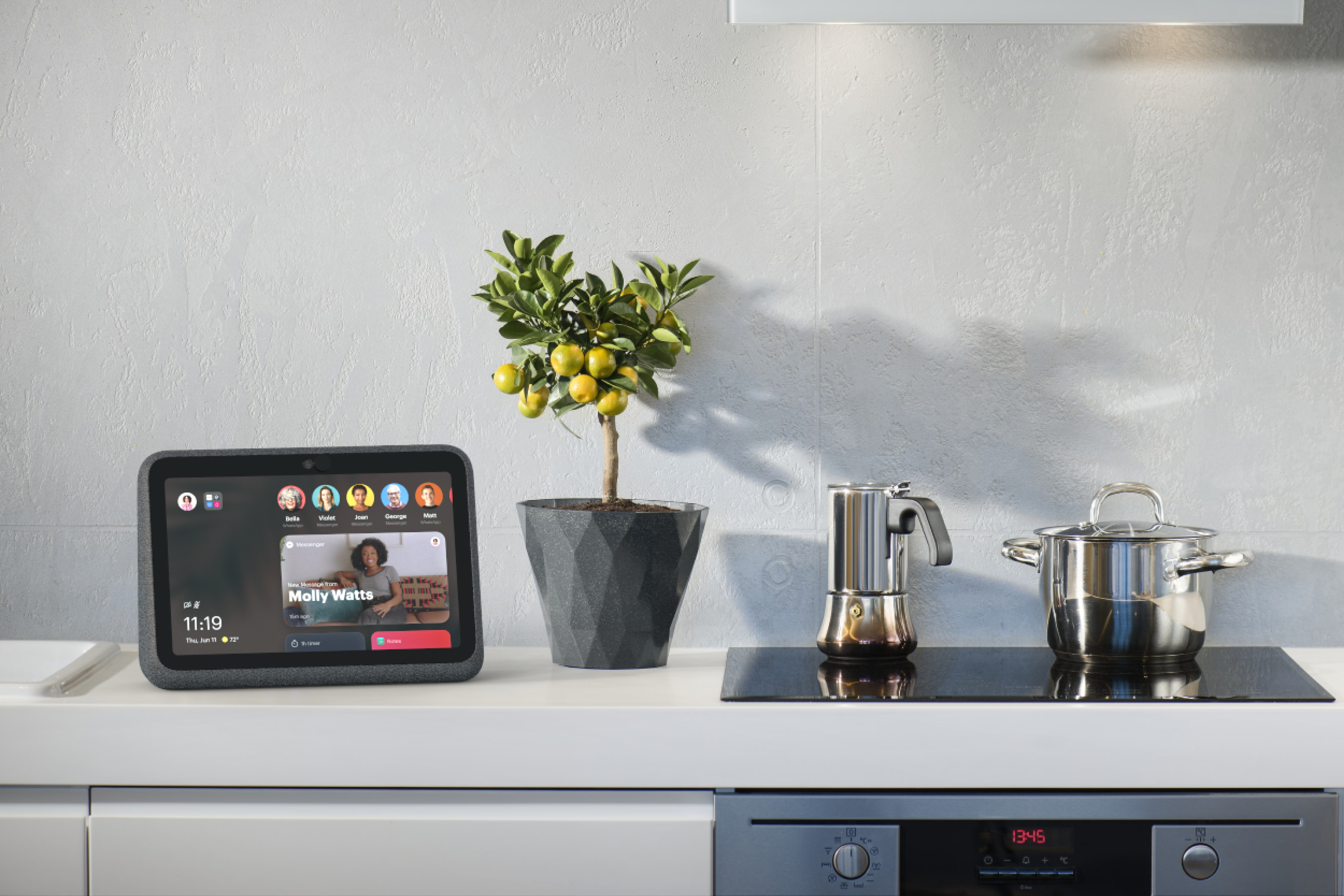
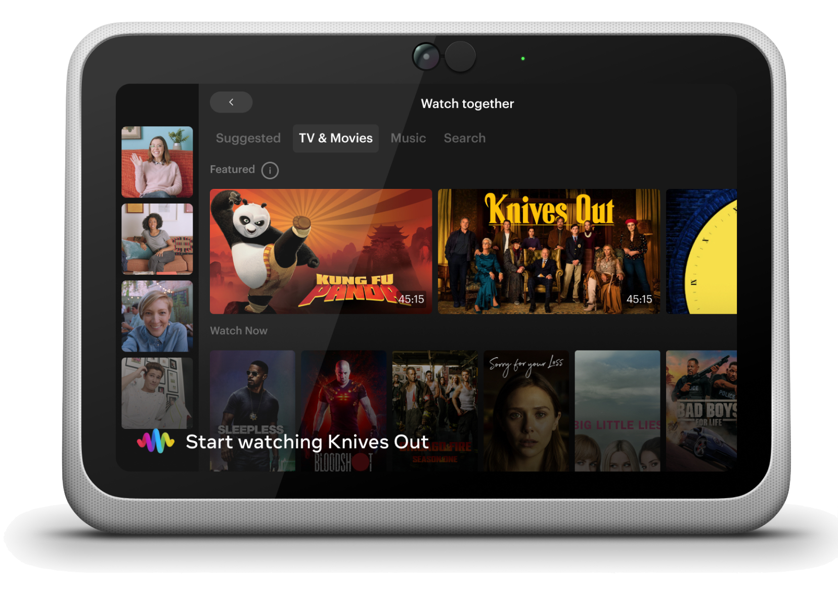
As Lead Product Designer for AI Assistant and Alexa on-device, I became the design authority for all voice interactions on Portal. My responsibility was threefold: leveraging the Assistant Design System, defining the nuanced intelligence of the conversational experience, and surfacing the social graph data that Facebook, WhatsApp, and Instagram provided.
Portal occupied a competitive position: smart speakers existed, but none with the depth of our social graph. The device persona was "the smart houseguest" — it doesn't interrupt, responds respectfully when spoken to, and is approachable rather than technical. Designing to that persona meant restraint: the assistant needed to feel present without being intrusive, and capable without being overwhelming.
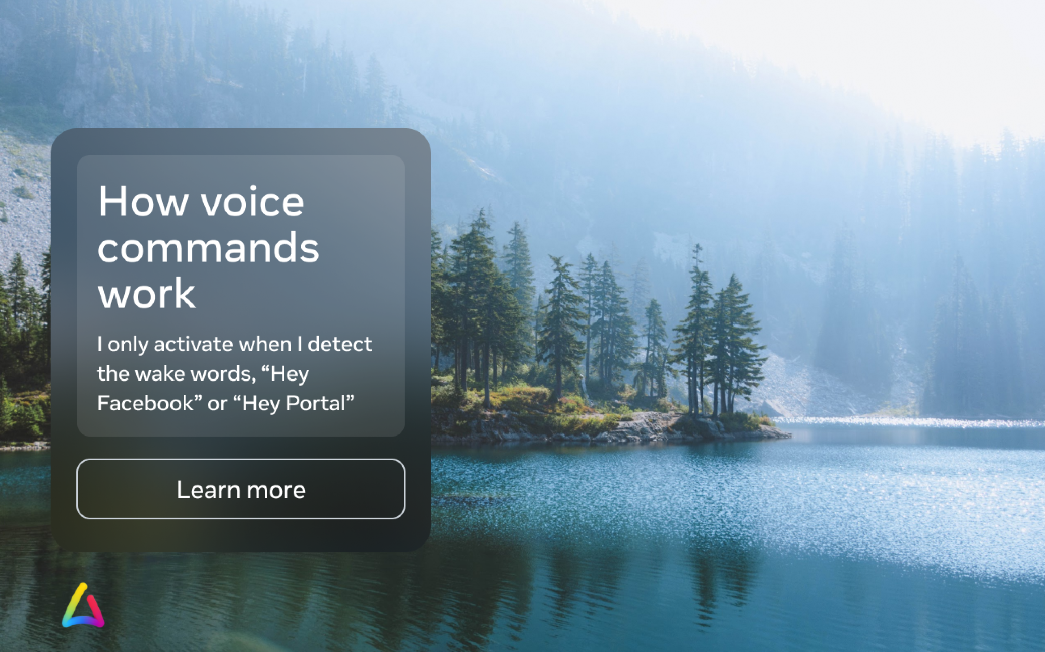
I worked both vertically with the device Human Interface teams and horizontally as Portal's voice SME across the company's natural language strategy. The work covered the full interaction spectrum: natural language understanding, wake-word design, utterance routing, task success optimization, and the challenge of running two assistants — Meta Assistant and Amazon Alexa — on a single device without creating confusion about which handled what.
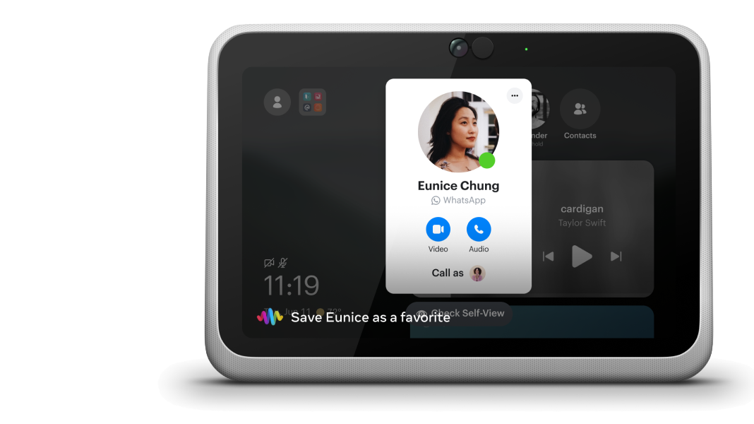
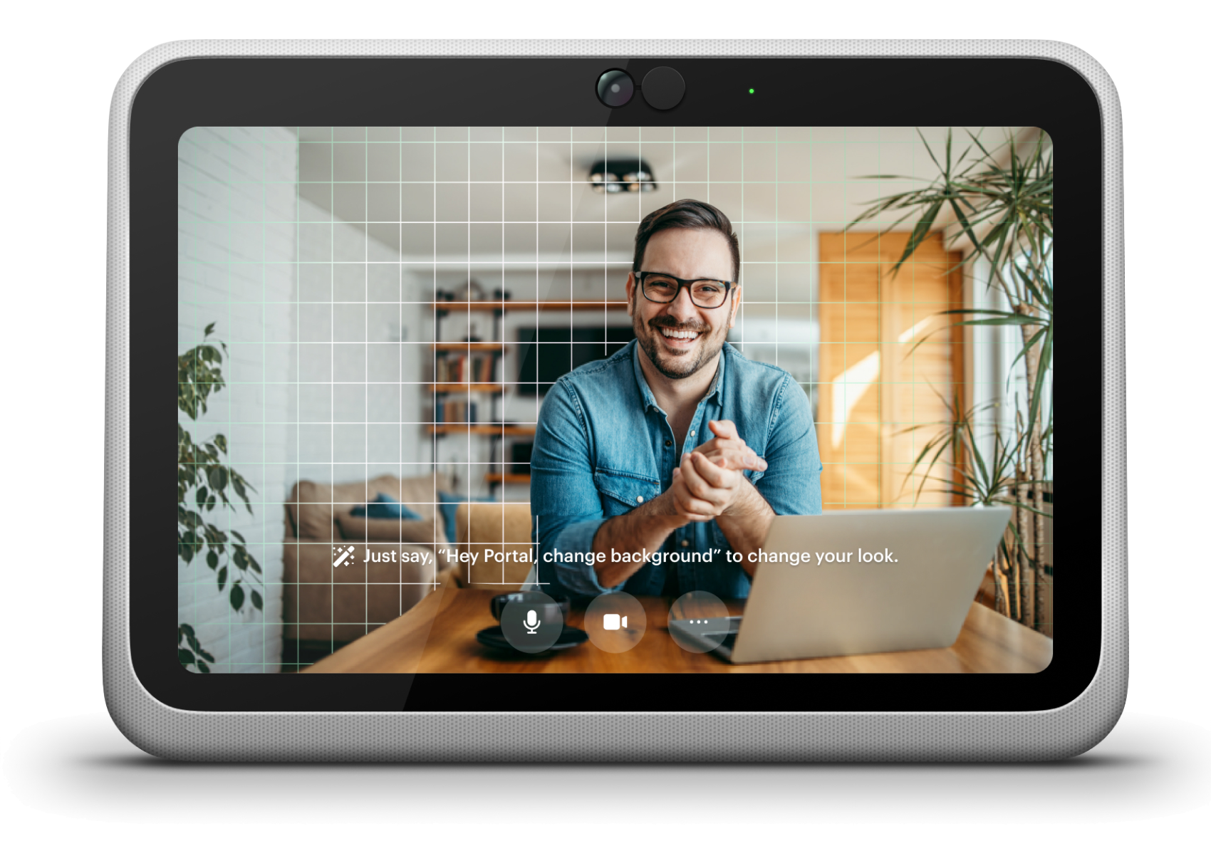
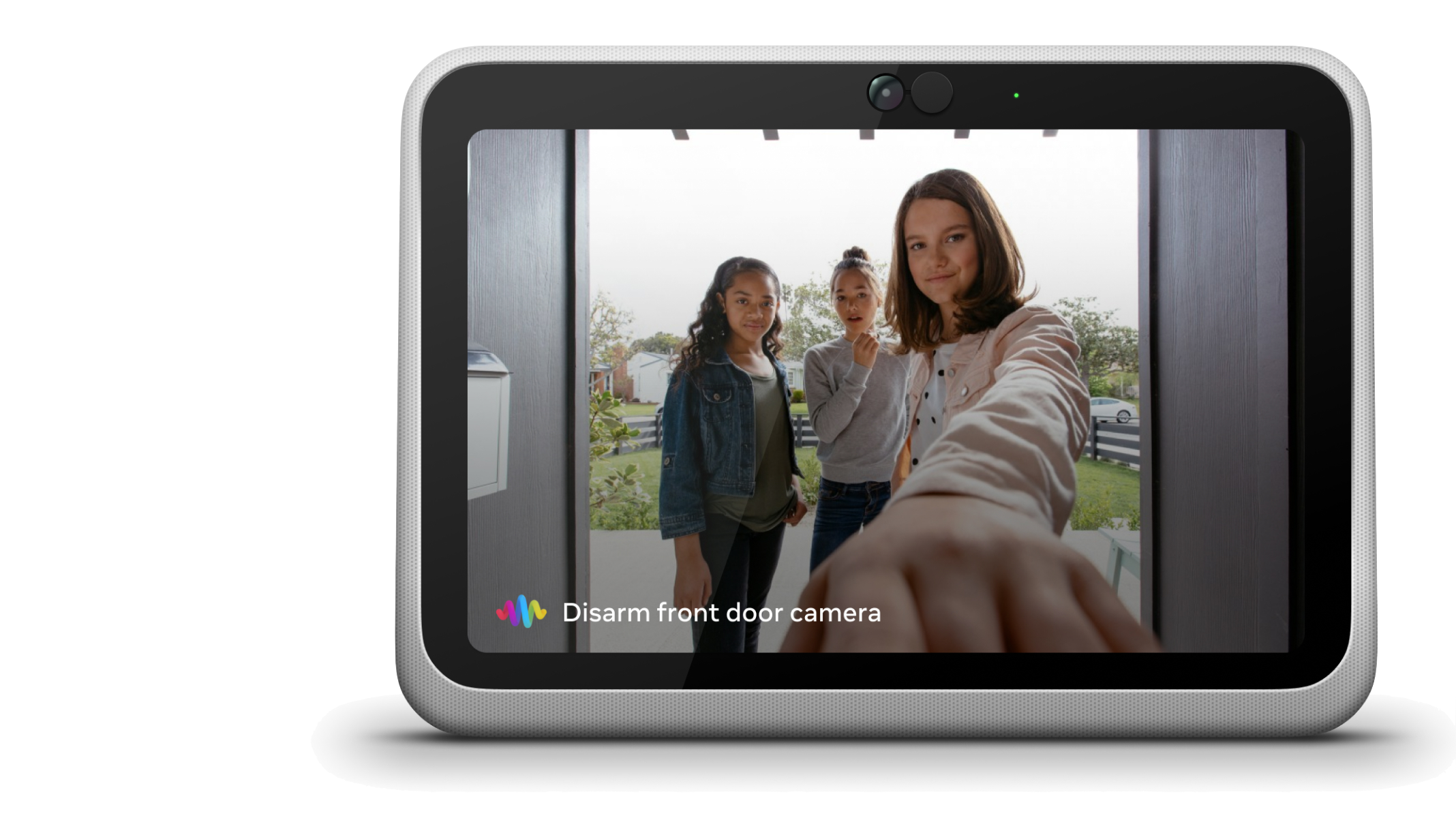
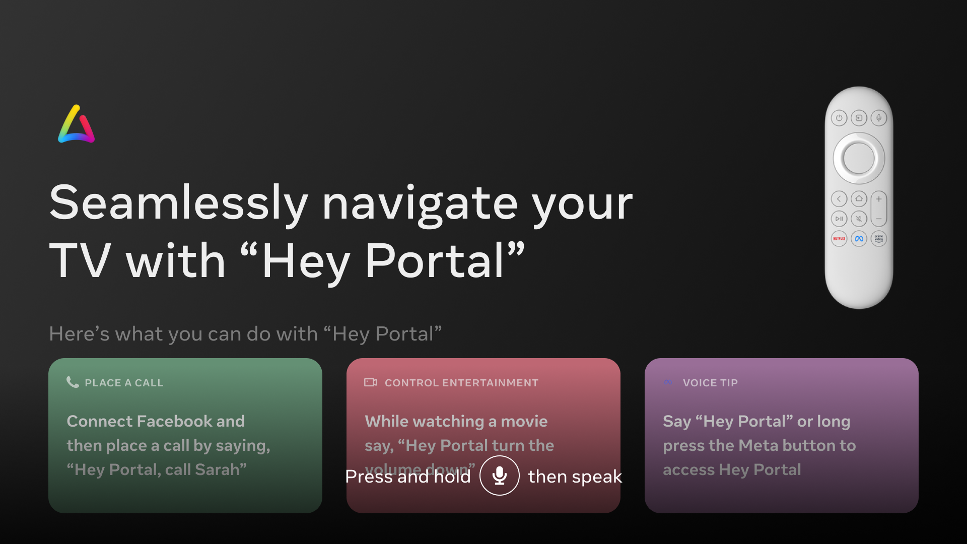
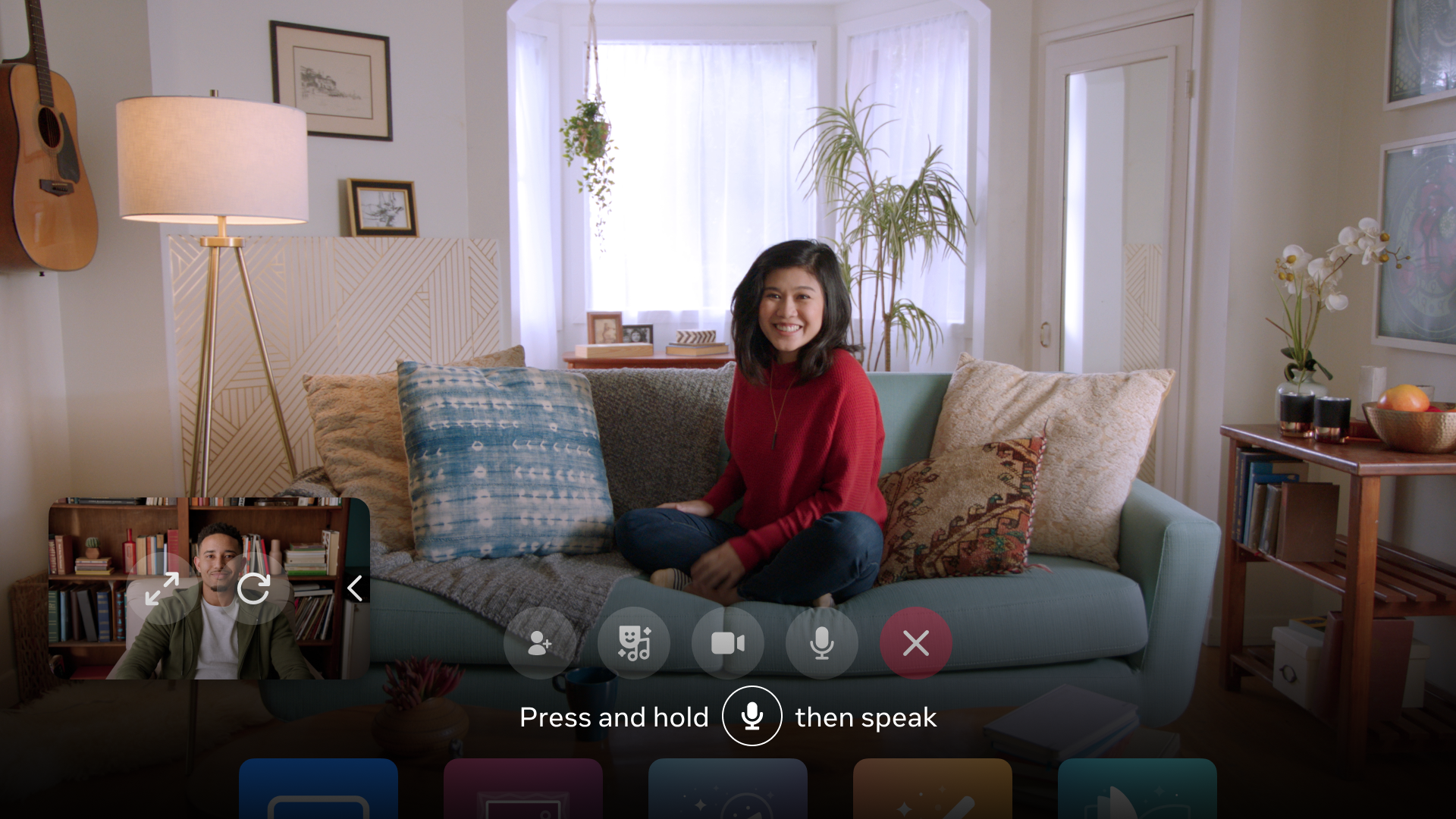
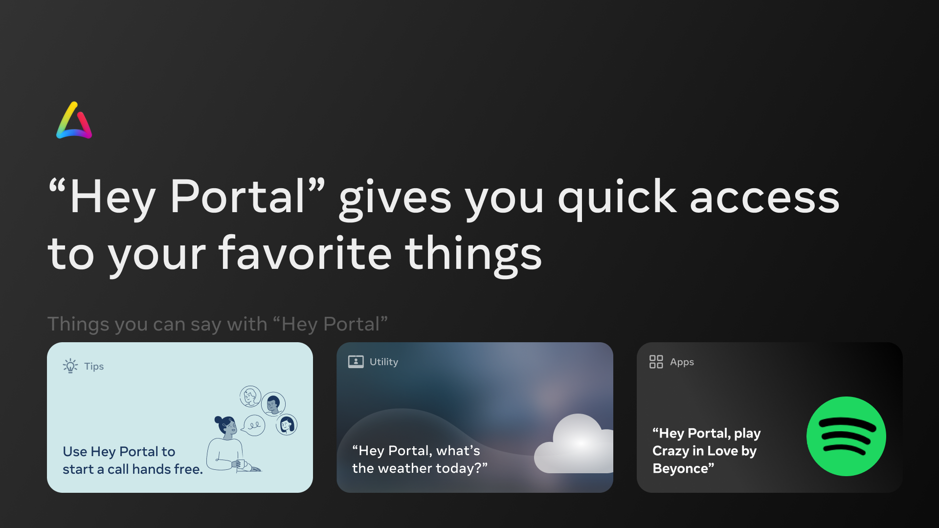
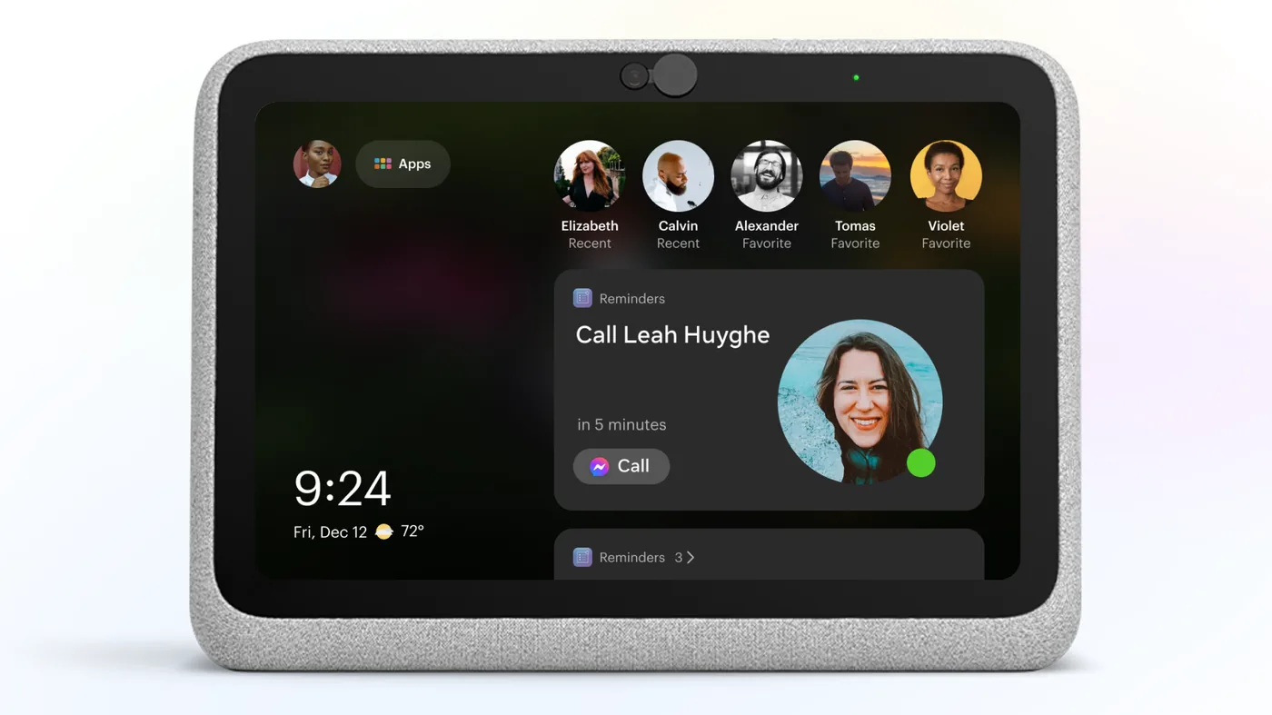
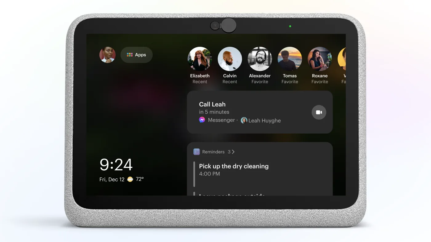
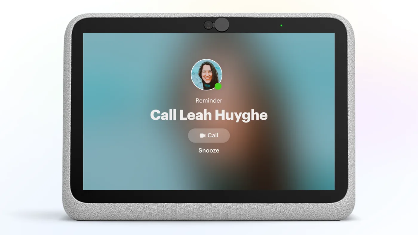
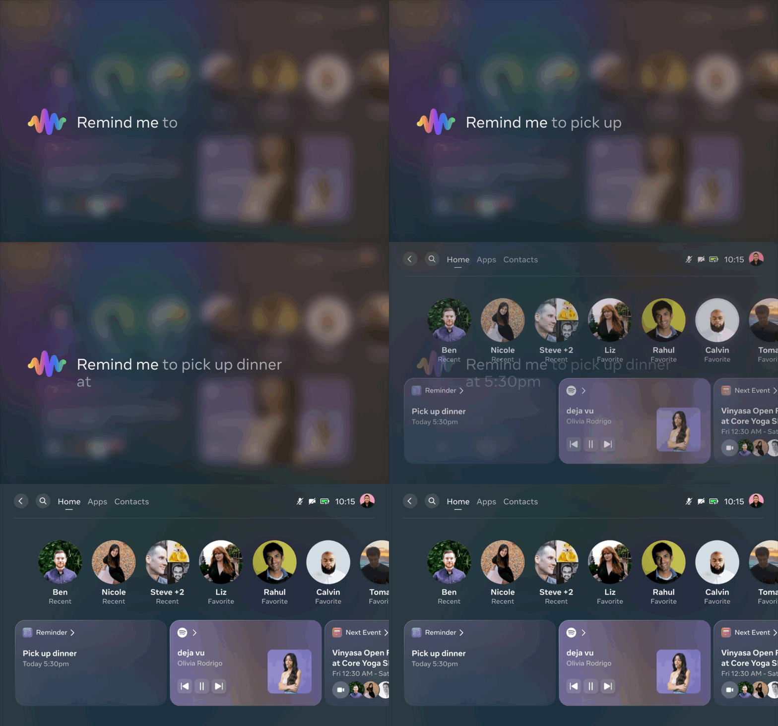
Designed the Reminders feature for Portal — a voice-first experience that let users set, manage, and receive reminders through Meta Assistant. The challenge was creating a system that felt lightweight and natural in a living-room context, where the interaction model differs significantly from mobile: no persistent home screen, no lock screen, and a shared-device dynamic with multiple household members.
The work spanned the full voice interaction loop, from utterance to confirmation to notification delivery. I collaborated with the Alexa team to ensure the experience worked consistently across both Meta Assistant and Amazon Alexa, including edge cases around disambiguation when multiple assistant platforms were active on the same device.
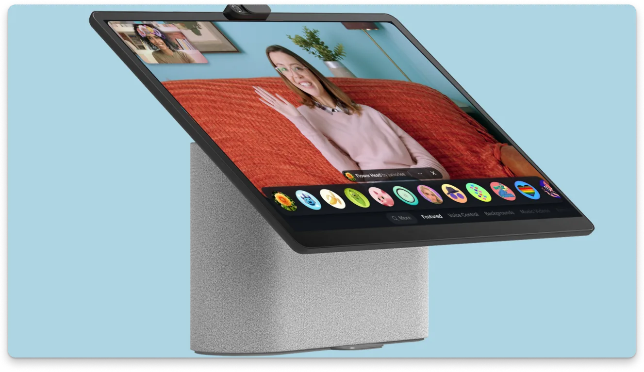
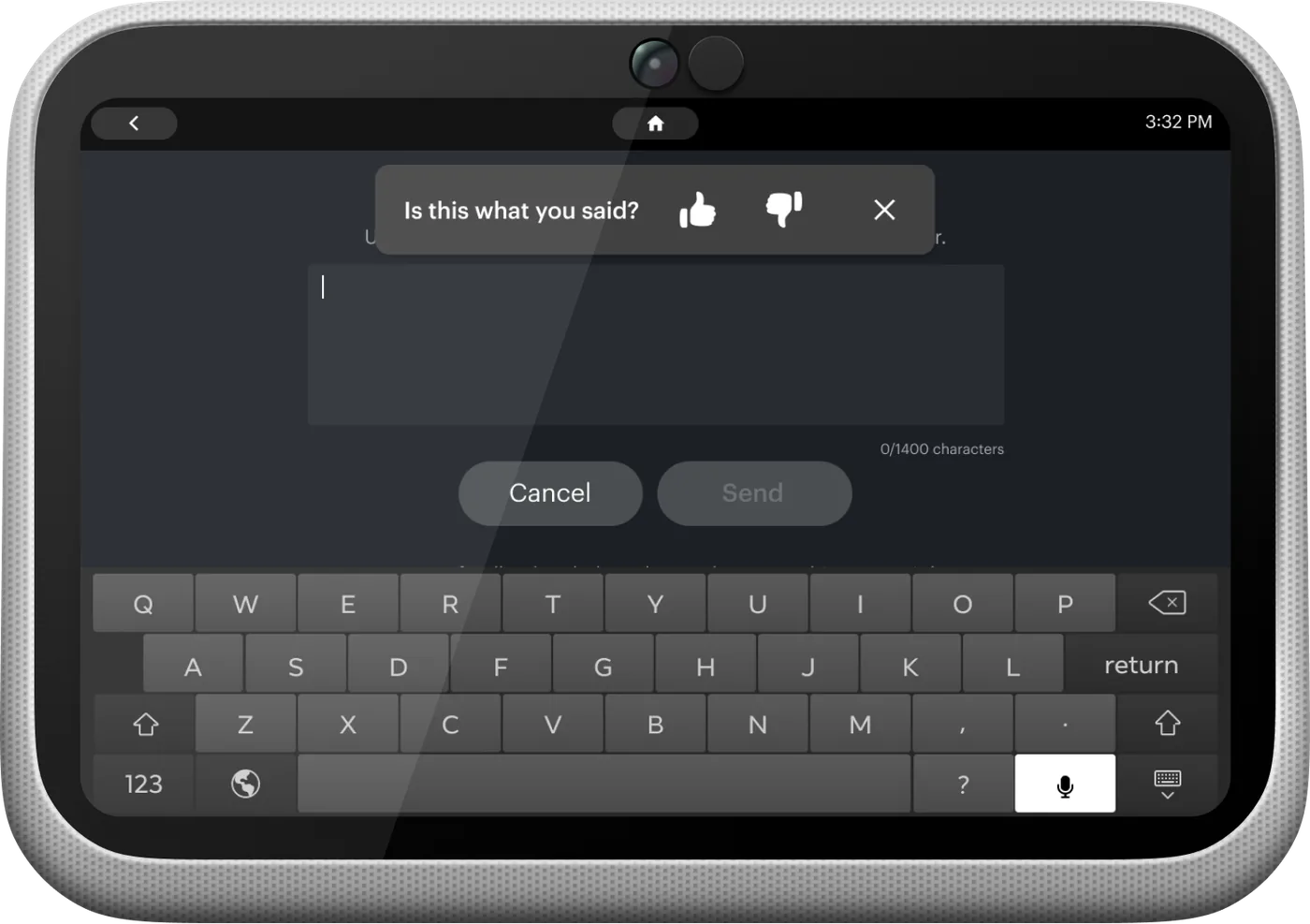
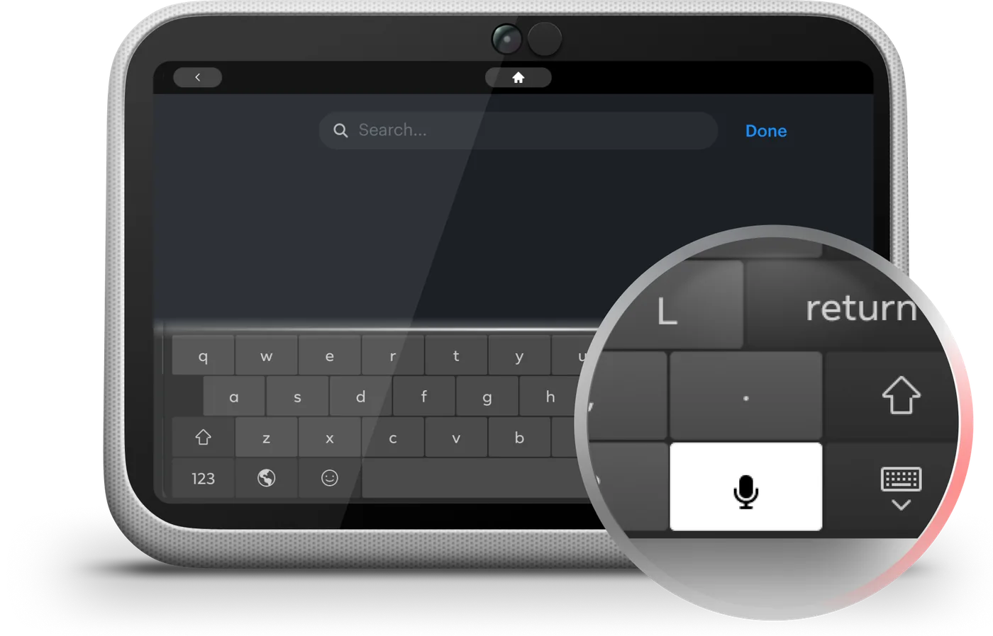
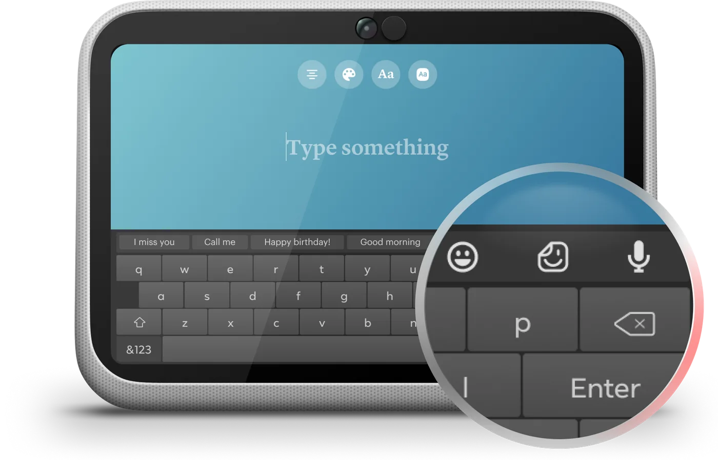
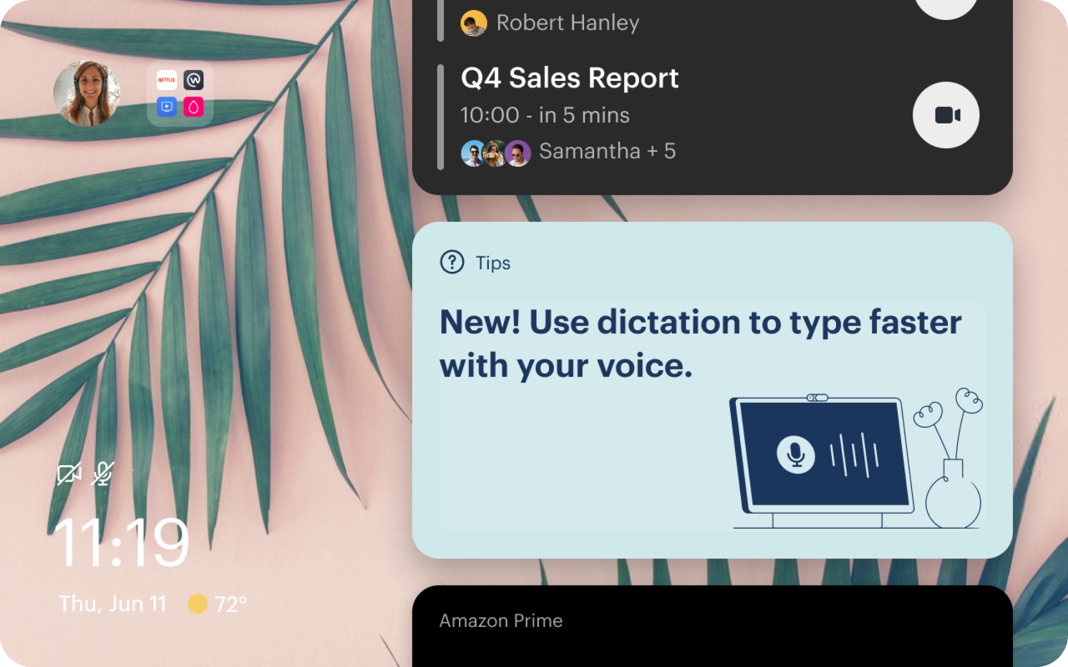
Typing on Portal is hard. The screen sits at a 105° tilt, the keyboard hadn't been meaningfully updated since 2018, and it was never designed for the surface. Community upvotes for voice-to-text were high enough that the feature appeared in users' top requests — and when typing is aversive, users avoid actions that require it: bugs go unreported, feedback goes unsent.
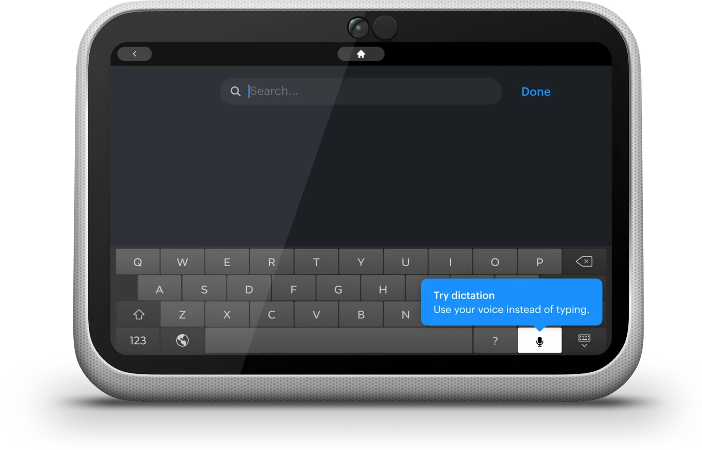
Three pain points defined the design challenge: inconsistent transcription accuracy, awkward error correction, and users feeling less in control the moment they activated voice input. These compounded — inaccuracy amplified the correction burden, and a clumsy correction flow erased whatever efficiency dictation was supposed to provide.
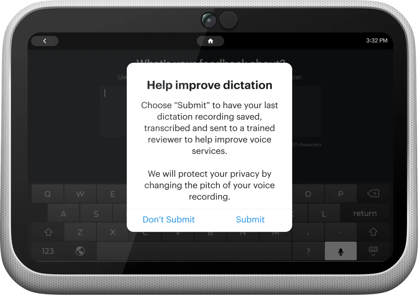
The key design decisions: an explicit education and consent flow before first use; a Keyboard Glowbar to make the active listening state unmistakable; mic button placement that required re-arranging existing keyboard keys; and a post-session feedback mechanism with opt-in transcription sharing to improve accuracy over time.
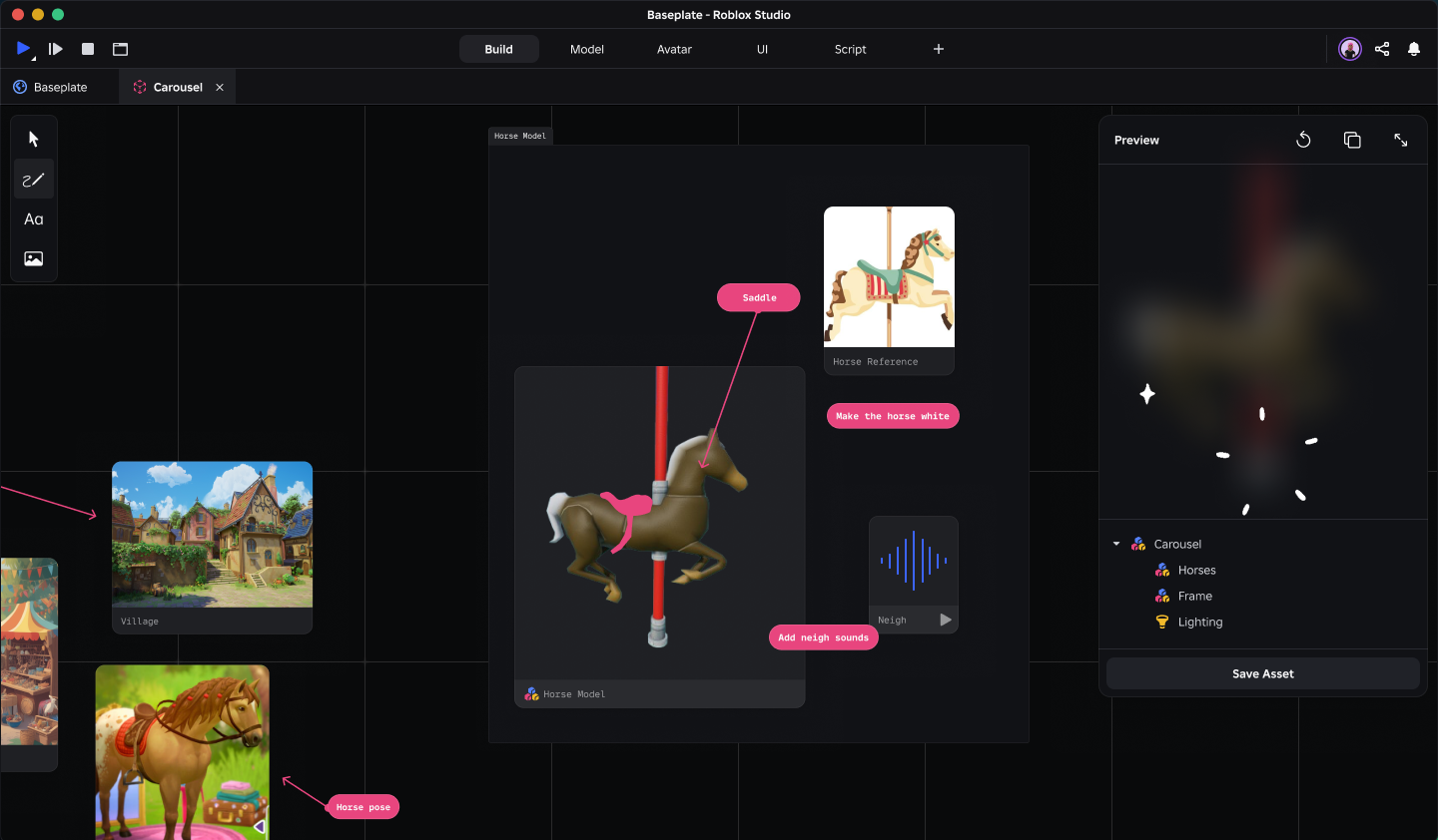
One day, my manager, Tyler, tasked me with projecting Studio into the future: what should the creation platform look like three years from now? Armed with rough sketches and notes from a workshop, I was given the mandate to define how Studio could move beyond current market trends and become a more competitive game production tool.
The vision centered on a set of forward-looking capabilities: AI prompting, Layers, Zones, and 3D mapping. My role was to translate those early signals into a coherent product direction, showing how these features could work together as a more powerful, modern creation environment.
I built this program because I saw a gap in how we develop associate and junior level talent. After mentoring four associate designers for a few years, I noticed a pattern: their struggles weren't primarily about craft or technical understanding. They were talented individuals. They struggled more with imposter syndrome, rejection of self, and functional freeze that came from not understanding the unwritten rules of how the org worked. I realized this was partially an organizational design problem.
Junior designers at Roblox were experiencing a gap between their perceived capability and actual capability. This surfaced as self-comparison, difficulty advocating for themselves and their needs, and a tendency to measure their worth against a narrow, visually-biased definition of what a "good designer" looks like. Often, that definition came from designers on X, YouTube, or Instagram who ran agencies and had decades of experience on them. The result was under-contribution from these associates, who had real things to offer.
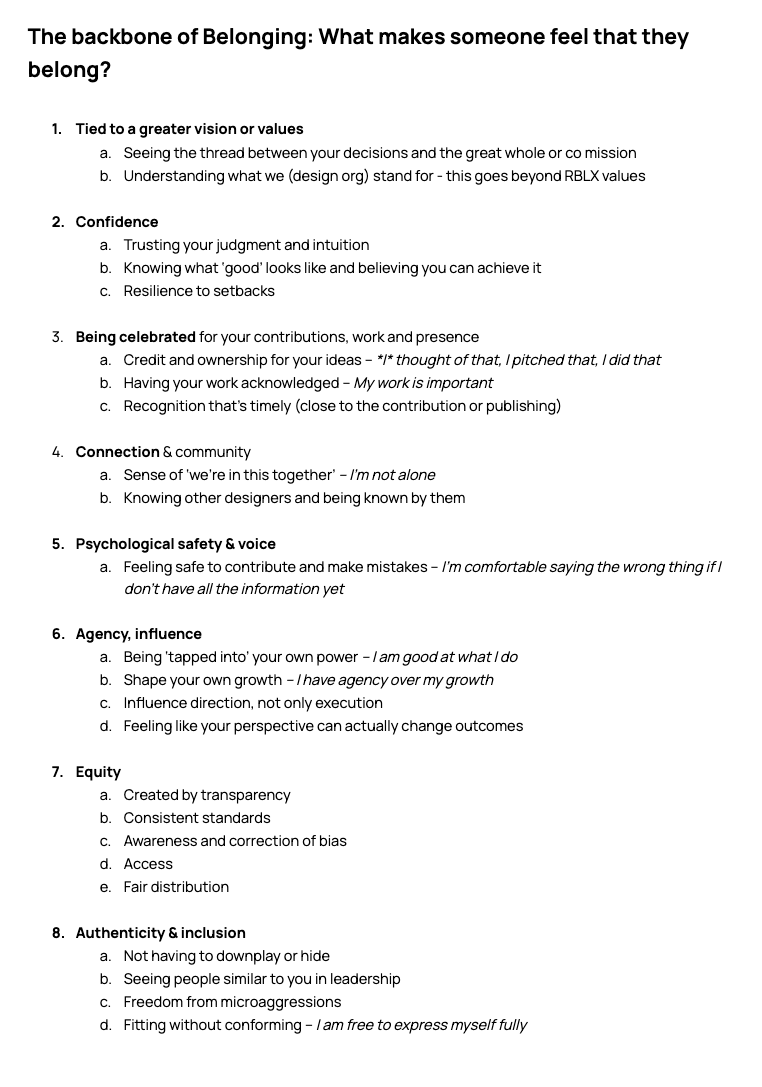
I structured the program around four pillars:
Connecting designers to the broader mission so their daily work feels legible within a larger whole.
Building confident self-assessment rather than comparison-driven anxiety about where they stood relative to peers.
Expanding what counts as a meaningful contribution beyond visible deliverables and shipping moments.
Giving designers language for their strengths without hierarchy or shame. Reframing "I'm bad at X" into "X isn't my primary archetype."
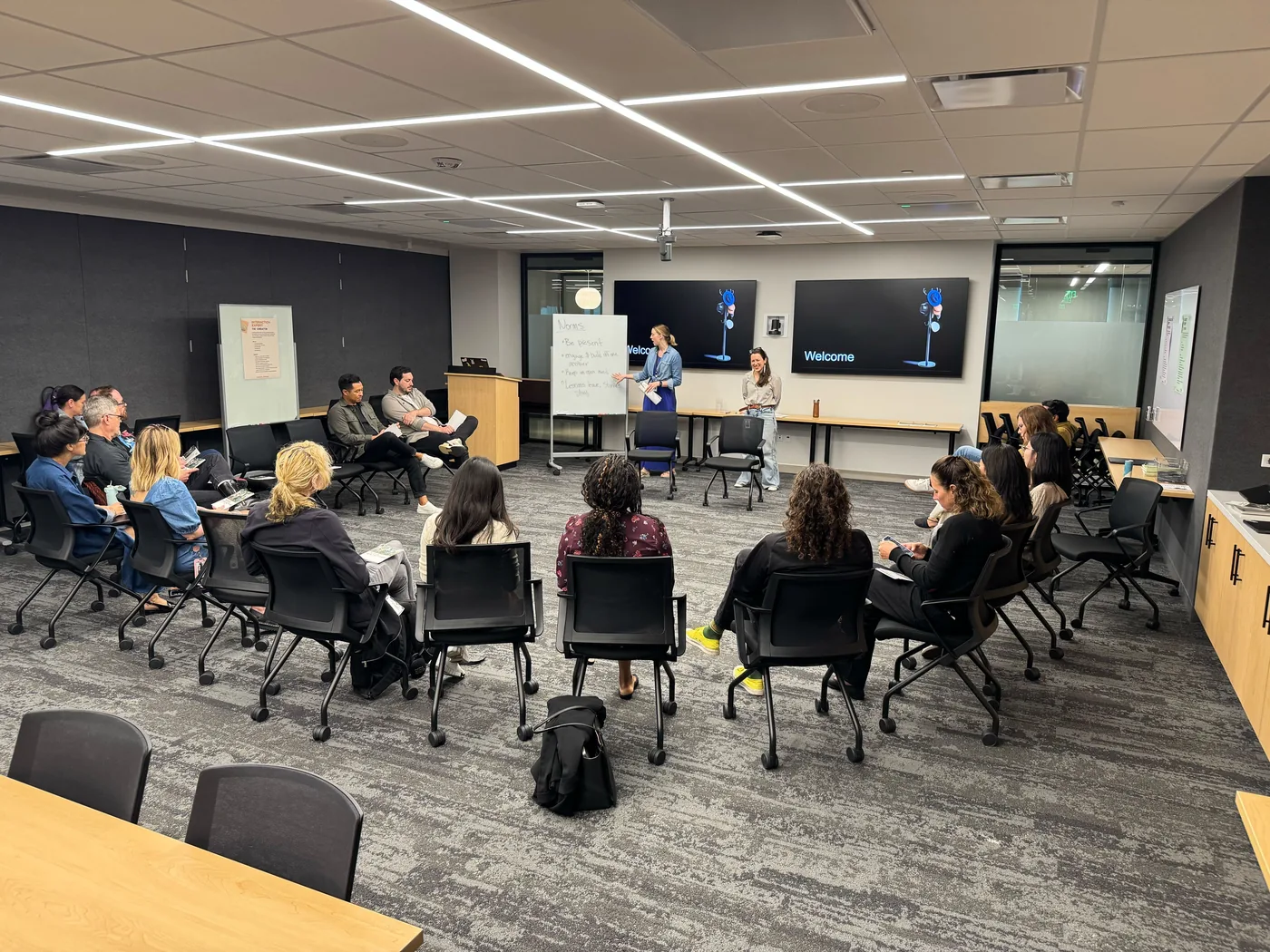
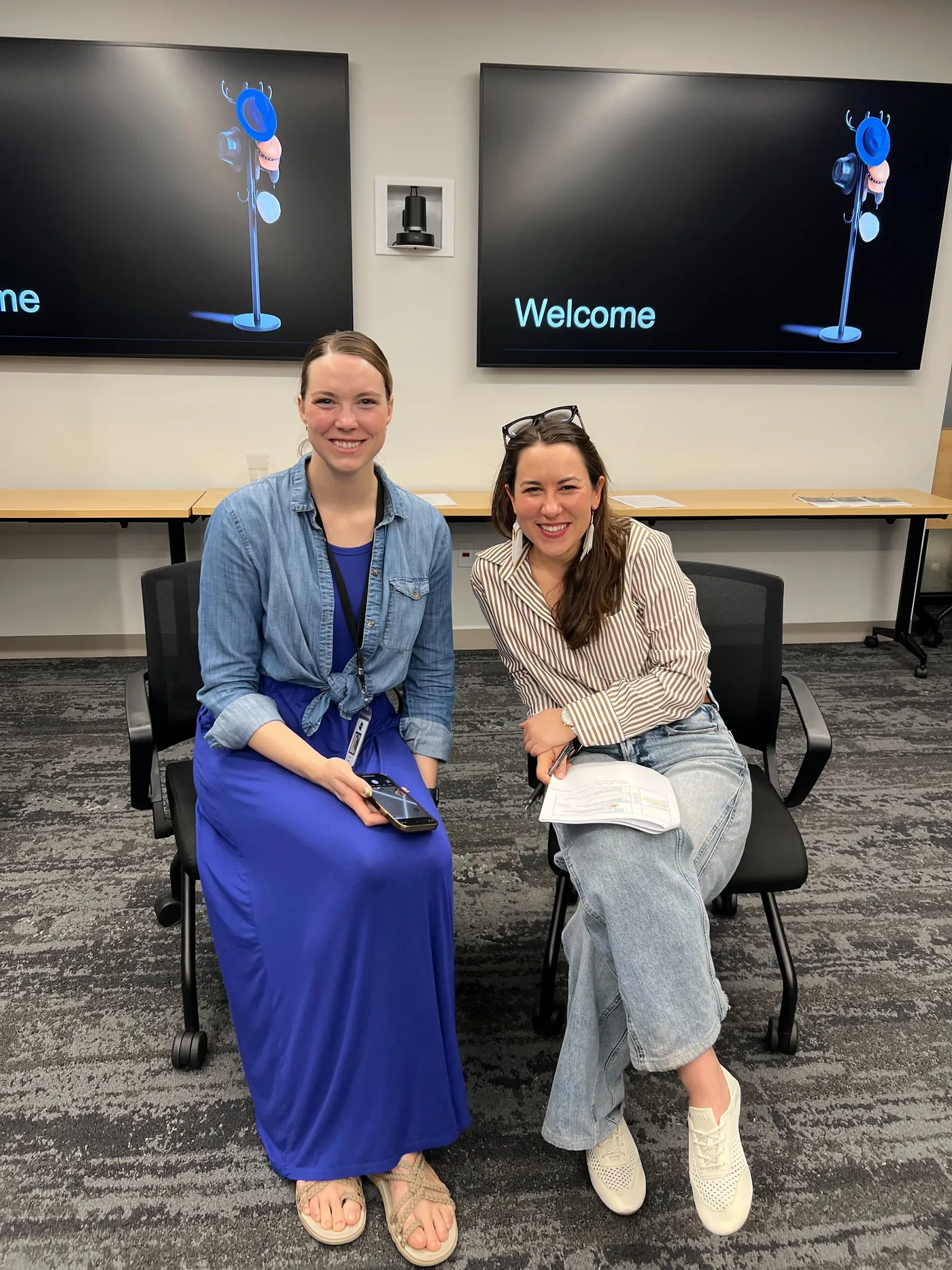
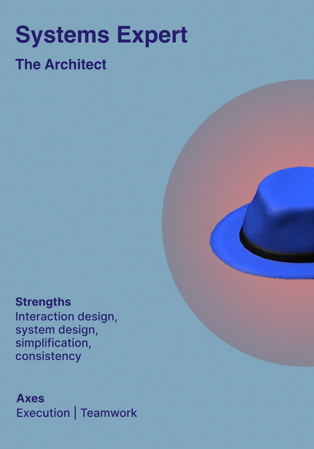
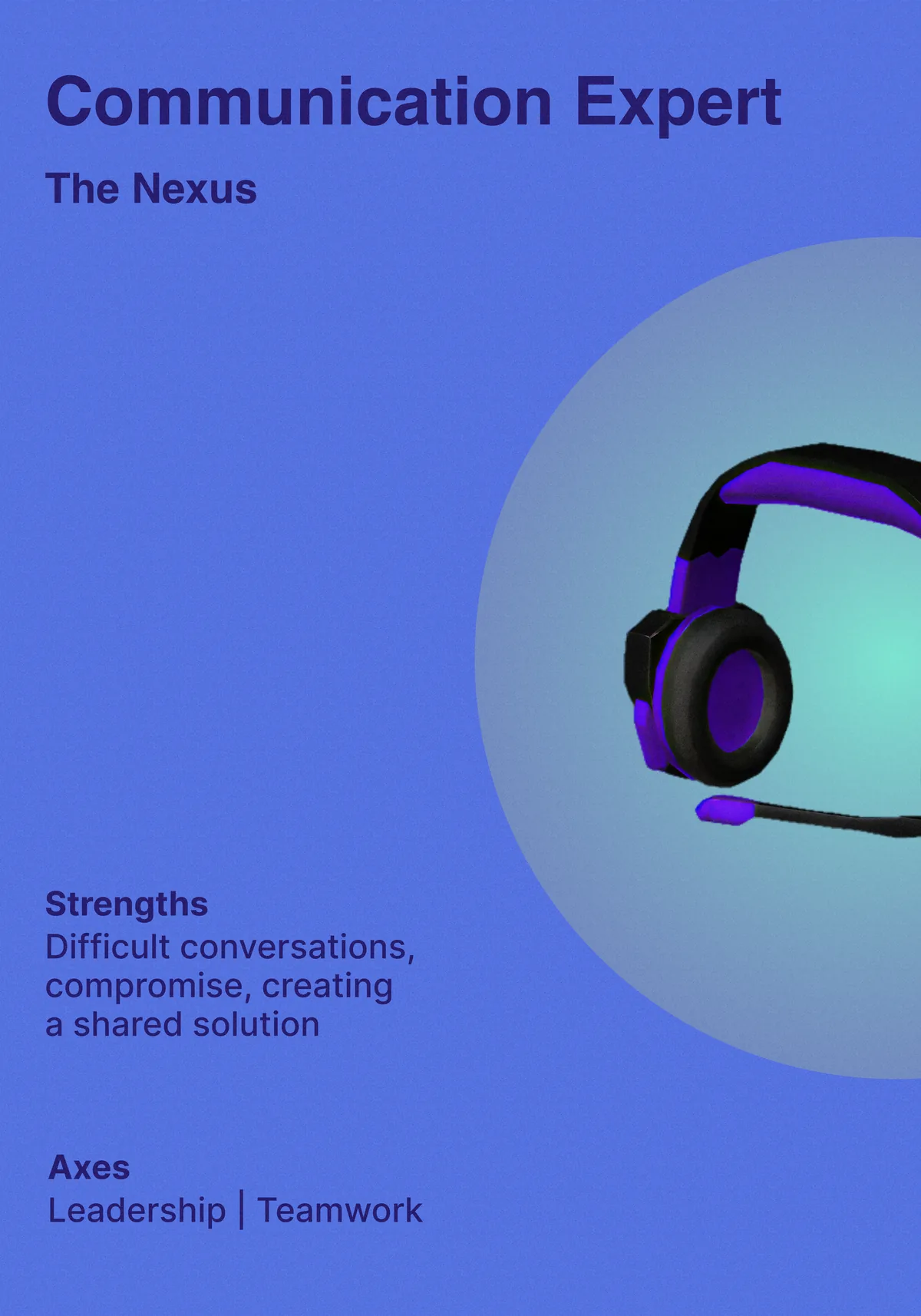
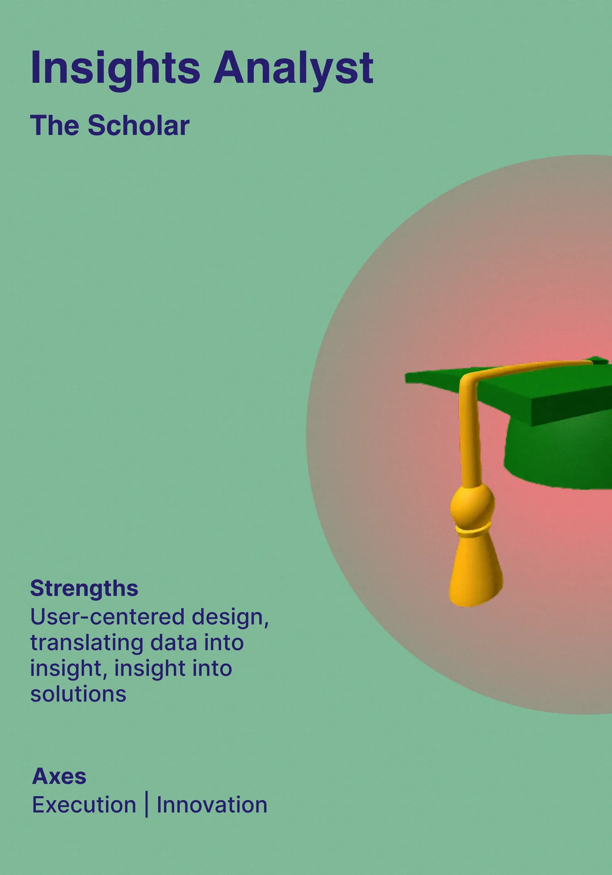
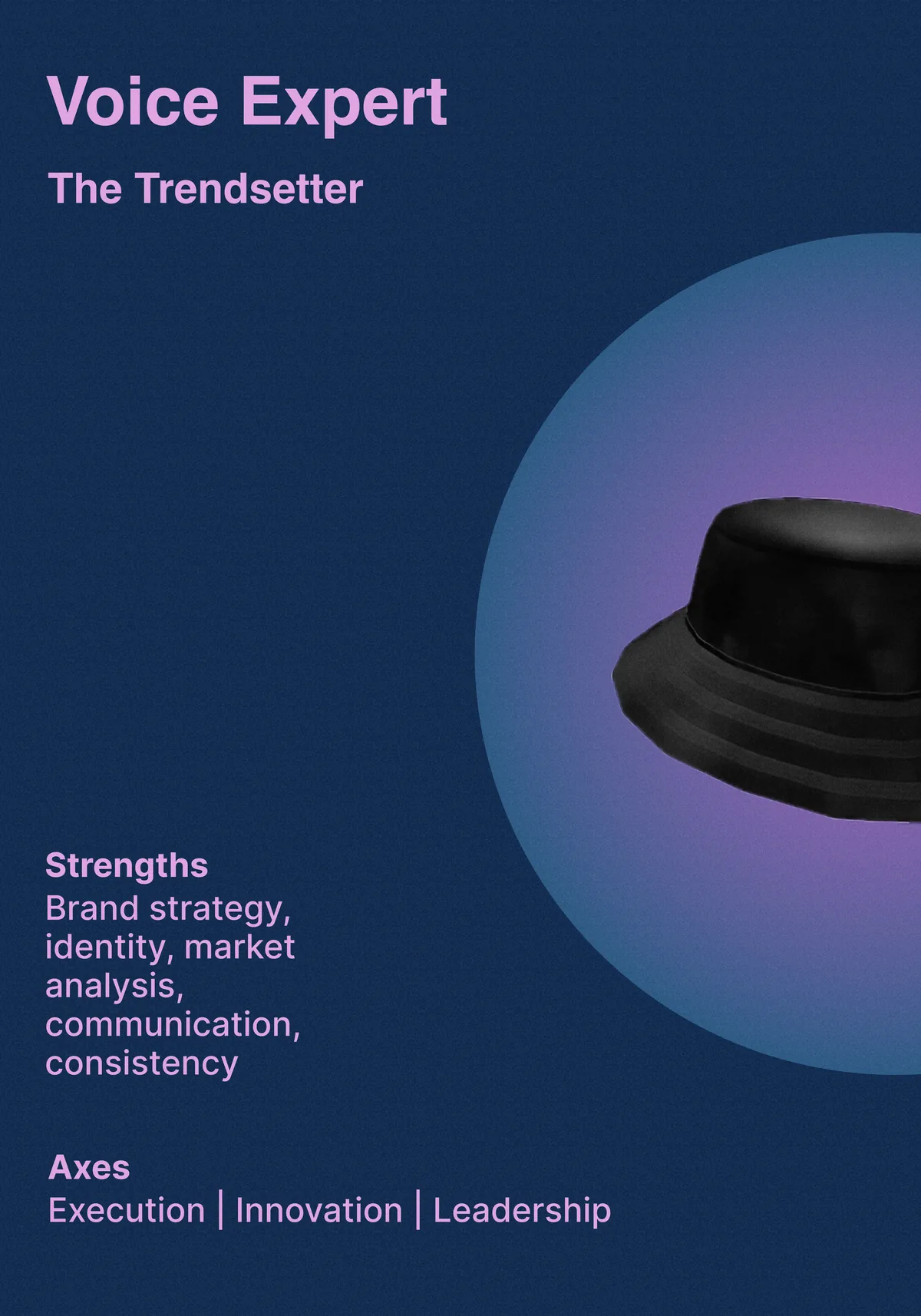
The Archetypes pillar was particularly significant. I co-designed and piloted the first workshop with my colleague Tabitha in August 2025. That shift in language consistently changed how designers and managers talked about their work.
Belonging isn't solved by inclusion alone. Designers also need to believe in their own capability, understand how their work fits into a larger whole, and receive recognition that reflects the full range of ways they contribute. When one of those is missing, the others don't compensate.
Design debt has a way of collecting quietly. A flow feels slightly harder than it should. A pattern gets reused before it is fully resolved. A small inconsistency survives because the next sprint has already started.
At Roblox Studio, we made space to address that debt directly. Design Quality Week became a twice-yearly sprint where designers paused feature work, cancelled most meetings, and focused on improving the product we had already shipped.
Studio had fallen into a familiar pattern: design was often pulled in after implementation had already started. That made designers responsible for improving work they had not been able to shape from the beginning, while quality improvements sat behind new feature work on the roadmap.
Design Quality Week gave the team a structure for doing the work on purpose instead of hoping it would happen in the margins.
The week ran Monday through Friday, with each day serving a specific purpose in a compressed design sprint cycle.
The whole arc, from problem identification to design work to user feedback to leadership buy-in, happened in five days.
One of the more substantive pieces of work that came out of this initiative was building a shared definition of done. This sounds procedural, but it was actually one of the more clarifying exercises the team did, because "done" meant different things to different people.
We landed on a quality matrix across five criteria: usability, performance, inclusivity, craft, and delight. Against those criteria, we defined five quality levels ranging from Prototype ("inspires belief that the product will be good with iteration") through to Polished ("product is crisp with few or no bugs, we are proud to show this work").
Having this framework made design reviews more productive. Instead of subjective debates about whether something was ready to ship, we had a shared vocabulary for where a design sat and what it would take to move it up a level. It also made it easier to have honest conversations about scope: sometimes the right answer was to ship at Shippable quality rather than hold for Polished, and the framework gave us language for that tradeoff instead of leaving it implicit.
We paired this with a pre-flight checklist that design was responsible for clearing before handoff: Does this meet business goals? Is the PRD current and design-aligned? Has it been validated by UXR? Are components approved by the Visual Systems team? Has the e2e been built out across all surfaces? These weren't new questions, but putting them on a checklist made accountability clearer.
Critiques were a regular part of Quality Week, but they also connected to a broader effort to strengthen design reviews as a practice. The structure we used was intentionally fast: everyone shares links, feedback is direct and specific, and changes happen before the session ends rather than getting queued for later.
Part of what made this work was the expectation that designs were explicitly work-in-progress. Crits fail when designers feel they need to present finished work, because the stakes of criticism feel too high. Framing the midweek share as a fast feedback session, not a review, lowered that threshold. People showed rougher work, got better feedback, and iterated faster.
Protected time only works when it is prioritized well. Quality work needs real capacity, but a week is still limited. The Monday triage mattered because the team had to choose the few issues where focused effort would create meaningful progress instead of scattered motion.
Connecting to engineering early matters. The Friday leads review wasn't just a presentation; it was a funding conversation. Building that conversation into the structure of the week meant teams left with either a commitment or a clear answer about next steps.
Squashing design debt requires someone to own it. Quality Week gave the team a recurring moment of collective ownership. Twice a year, we cleared meetings and focused the team on debugging, craft, and accumulated design debt. Between those weeks, the pre-flight checklist and the definition of done kept quality visible as a daily practice rather than a standalone event.
Quality Week sat inside a broader Studio quality effort that also touched design reviews, PRD quality, and A/B testing. The common thread was simple: quality is a systems problem, not a talent problem.
The team already had the skill. What it needed was a recurring structure that made quality visible, funded, and shared. Five days twice a year was a real investment, but it created a moment where improving the product was the agenda.
I scale design impact through coaching, systems critique, mentoring, advocacy, and the rituals that help designers build stronger judgment over time.
Over the last four years, I've mentored four designers and managed three interns, with a focus on craft development, confidence, cross-functional navigation, and stronger design advocacy inside the org.
Lead with attention. Sweat the small stuff. Escalate what needs to be resolved. The user's attention is important, and so is the trust of the people doing the work.
The work should stretch us toward better judgment, stronger taste, and clearer systems thinking. Growth happens when the challenge is real and supported.
Mentorship is one way to shorten the distance between novice and mastery. I want designers around me to build confidence, conviction, and the ability to advocate for their work.




Consistent mentorship through critique, 1:1s, feedback, reflection, and advocacy.
Card Deck · 2024
For seven years, I had Lyme disease. During that time, I noticed something about the conversations that happen around chronic illness: they're not just hard — they're structurally broken. Healthy people, even well-meaning ones, don't have a framework for what sustained, invisible suffering looks like day to day. Caregivers go quiet because they're afraid to say the wrong thing. Patients go quiet because explaining feels exhausting, and the exhaustion is already a symptom.
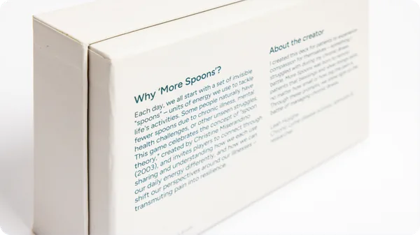
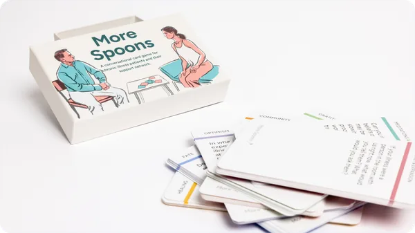
More Spoons is a card deck. I built it to give both sides something to hold onto. It's not a script, but a companion for intentional conversation and unfolding. Open-ended prompts that meet people wherever they are.
Spoon theory is shorthand many people with chronic illness use to describe limited energy: you start each day with a finite number of spoons, and every activity costs one. By the time a patient has gotten dressed and eaten breakfast, they may already be running low. I wanted the name to carry that weight without requiring explanation. The challenge was making sure the deck didn't feel like it was just merchandising someone else's metaphor. The name references spoon theory; the deck doesn't depend on it. Someone who's never heard of it can still use the cards.
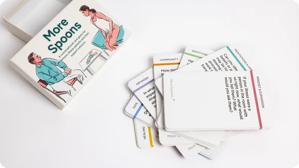
Seventy cards across seven categories: Community, Healing, Optimism, Fate, among others. Ten prompts each. The categories were chosen to cover different emotional registers, from gratitude and connection to harder questions about identity and acceptance, so there's something useful at different points in an illness journey, not just during a crisis.
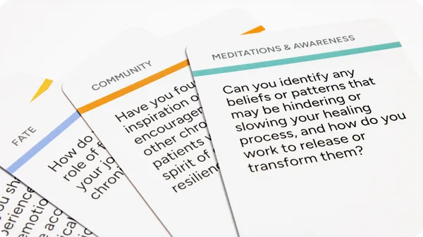
Tone was the hardest thing to get right. Clinical language would have been alienating. Overly cheery, "you've got this" language would have felt condescending, maybe even cruel, to someone in real pain. I landed somewhere I'd call honest and gentle: prompts that take the experience seriously without dramatizing it.
Open-endedness required discipline. Every time a prompt leaned toward a specific answer, I cut it or rewrote it. The card isn't meant to tell you something. It's meant to give you a starting point for a conversation you might not have been able to start otherwise.

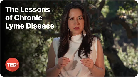
This talk is about what chronic Lyme disease taught me, and about why Lyme specifically demands a different kind of conversation than the one we are currently having.
Chronic Lyme is a circular problem. It does not move in a straight line from infection to treatment to recovery. It cycles: hope, relapse, misdiagnosis, the grinding work of convincing providers that something real is occurring. Inaccurate testing methods fail up to half the time. Even with a positive blood test, research shows nearly 80% of physicians remain skeptical of the patient in front of them. I felt it was necessary to say this out loud publicly because most conversations about Lyme treat it like an acute illness with a clear endpoint. Chronic Lyme is not that. The gap between how the medical system imagines it and how patients actually live it causes its own damage, on top of the disease itself.
This invisible illness catalyzed transformations that shape who I am today. I champion this cause not only because it has claimed so much of my lifetime, but because those battling Lyme deserve to have their voices heard. Public understanding remains dangerously low compared to its severity and prevalence.
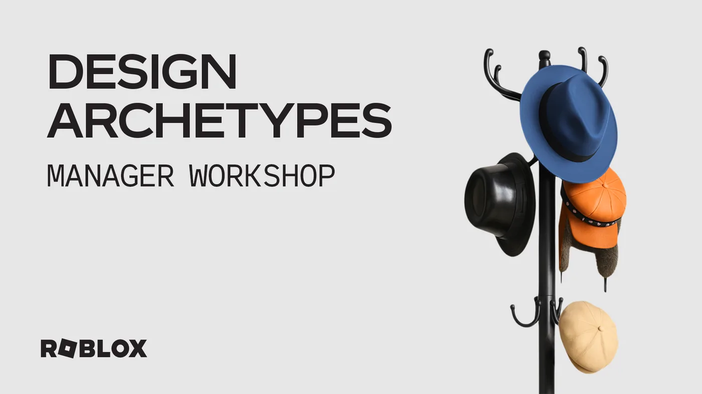
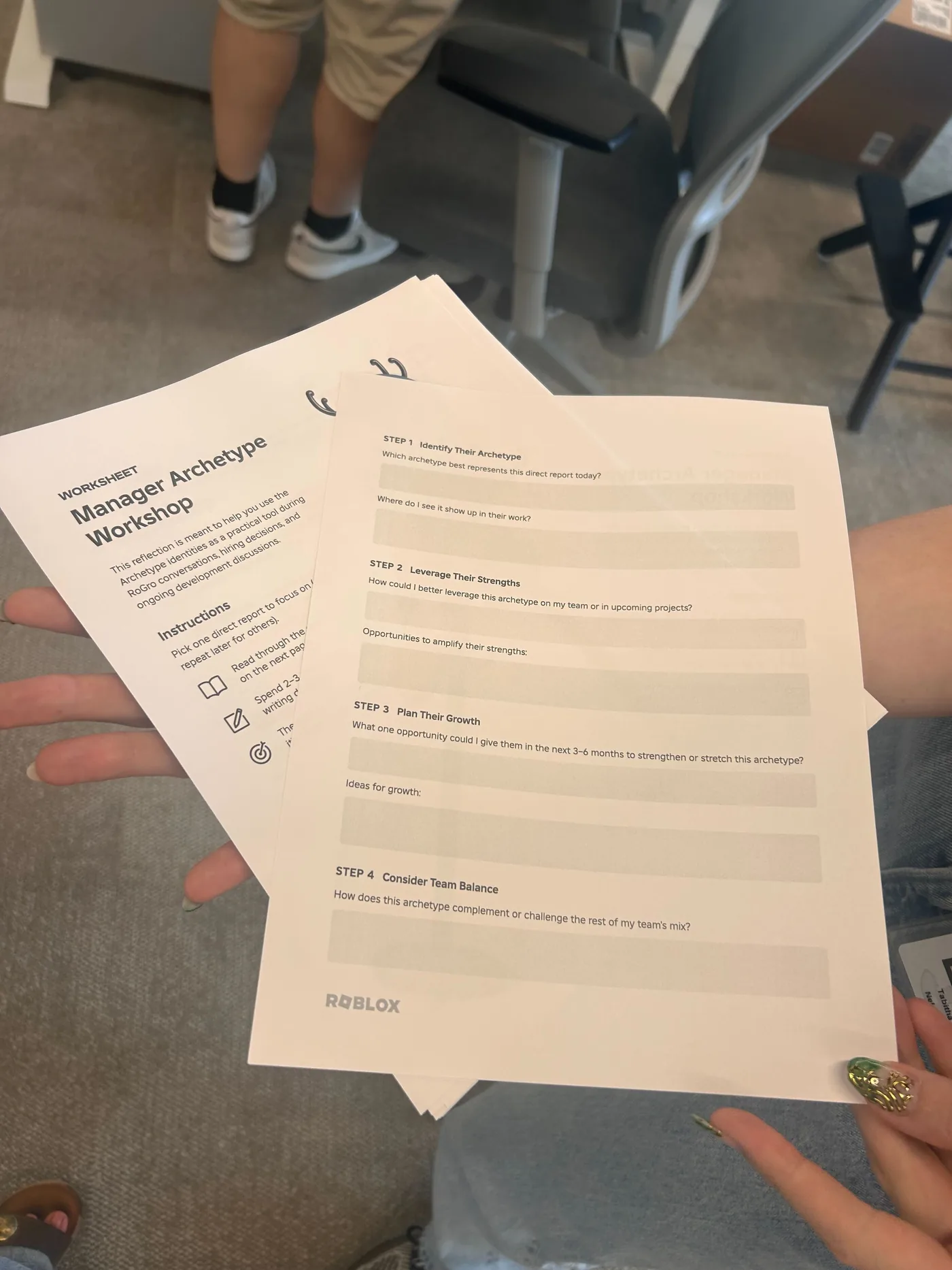
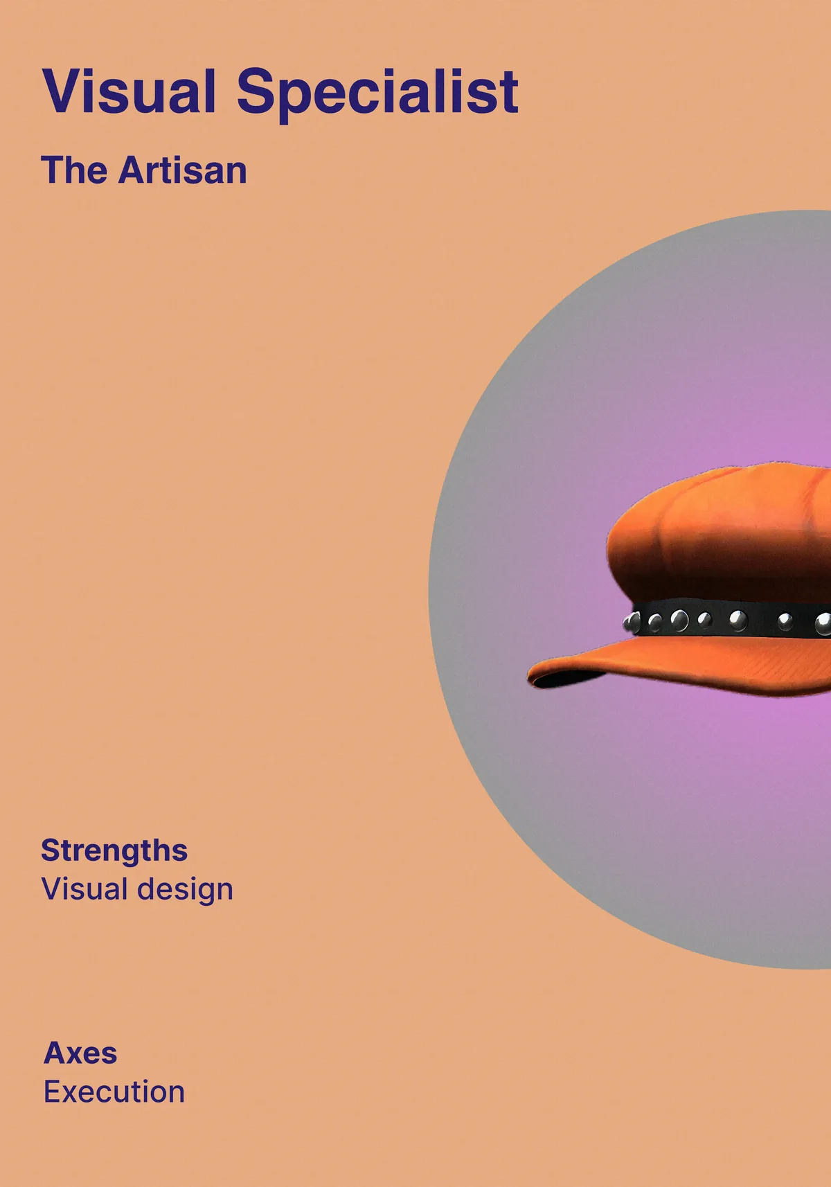
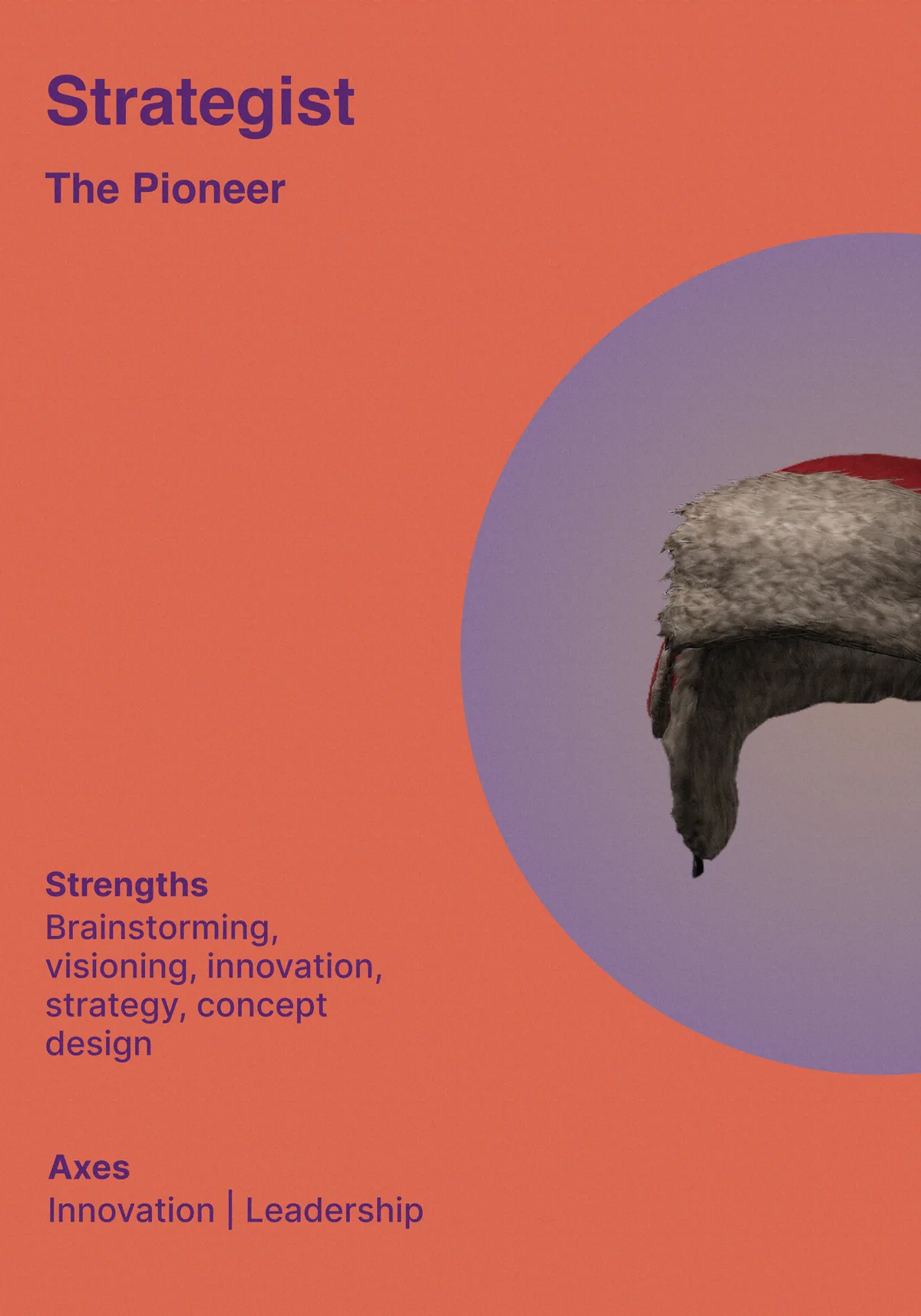
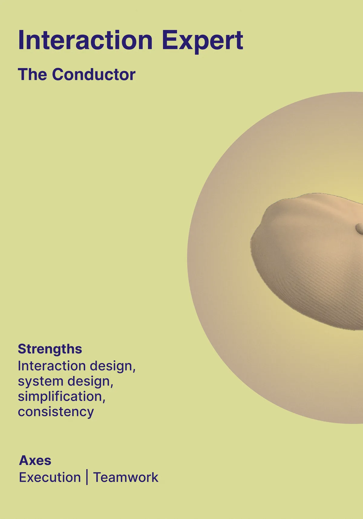
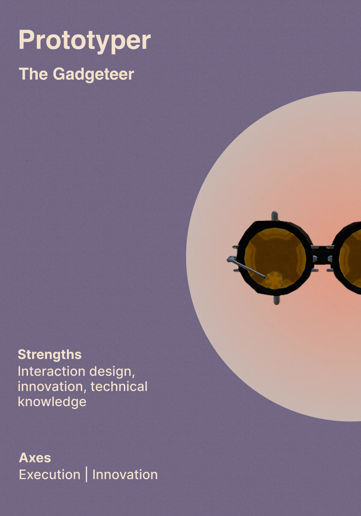
This framework gives designers and their managers a shared vocabulary for strengths-based career development. It supports individuals in identifying where they generate the most value, and helps managers have more specific conversations about growth. After the workshop, the archetypes vocabulary became deeply embedded in how designers and managers talked about strengths, growth, and team composition.
Most designers lead with one or two archetypes. The goal is to understand your primary orientation.
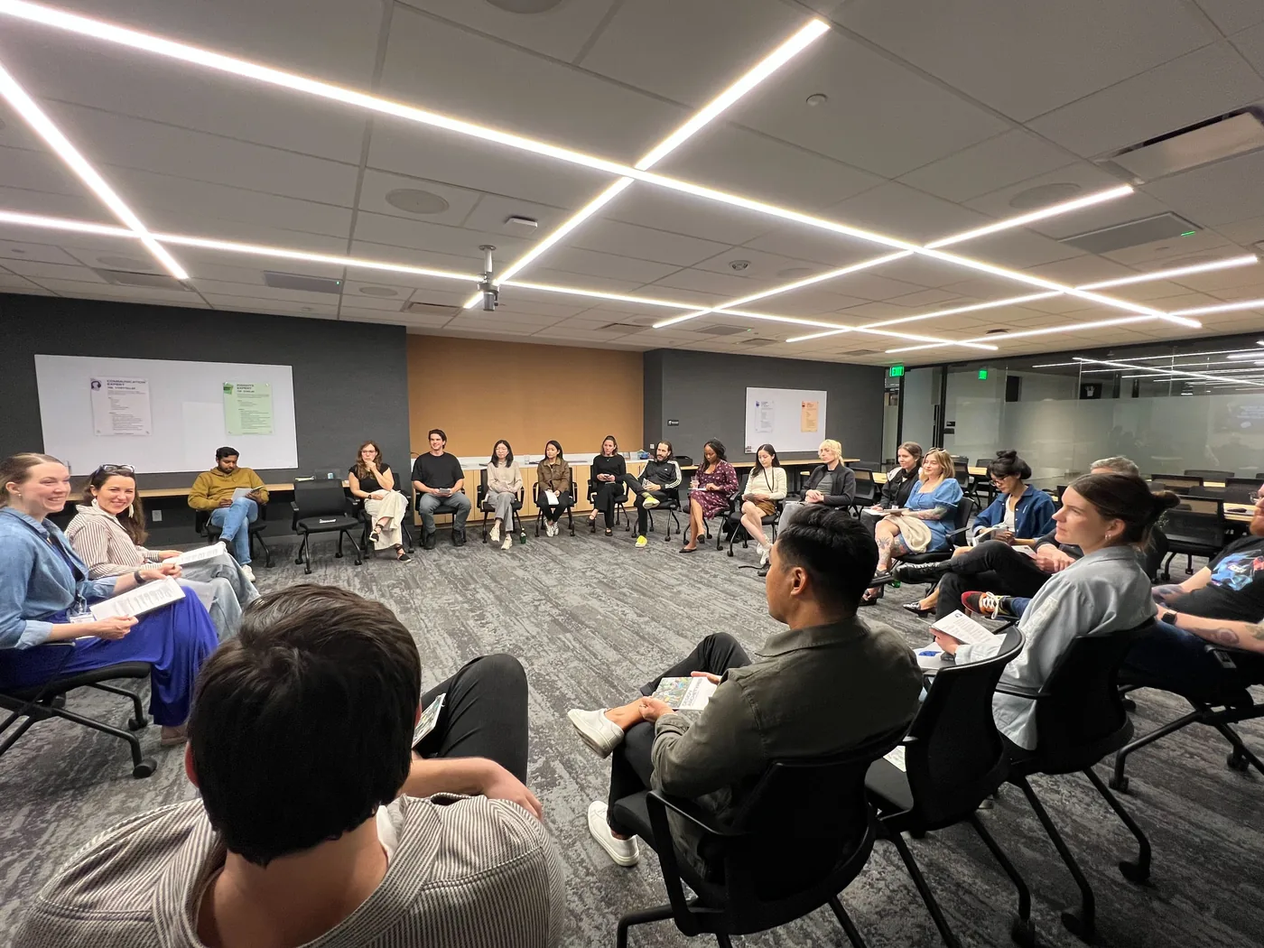
We discussed: "What kind of creative identity do you lead with, and why does it matter?" We created a gallery walk where participants identified archetypes in their direct reports and thought through how to leverage their strengths. We also practiced conducting archetype-based 1:1 conversations. Participants left with a practical playbook and a shared vocabulary for use in performance conversations, hiring decisions, and ongoing development discussions. The session had 25+ managers/directors, earned all-time high ratings, and gave the org language that continued to show up in everyday design conversations.
Each archetype represents a distinct orientation toward design work. Designers are responsible for charting their own growth; managers are expected to understand each person's strengths and provide ongoing feedback. Growth paths should be flexible and acknowledge individual uniqueness.
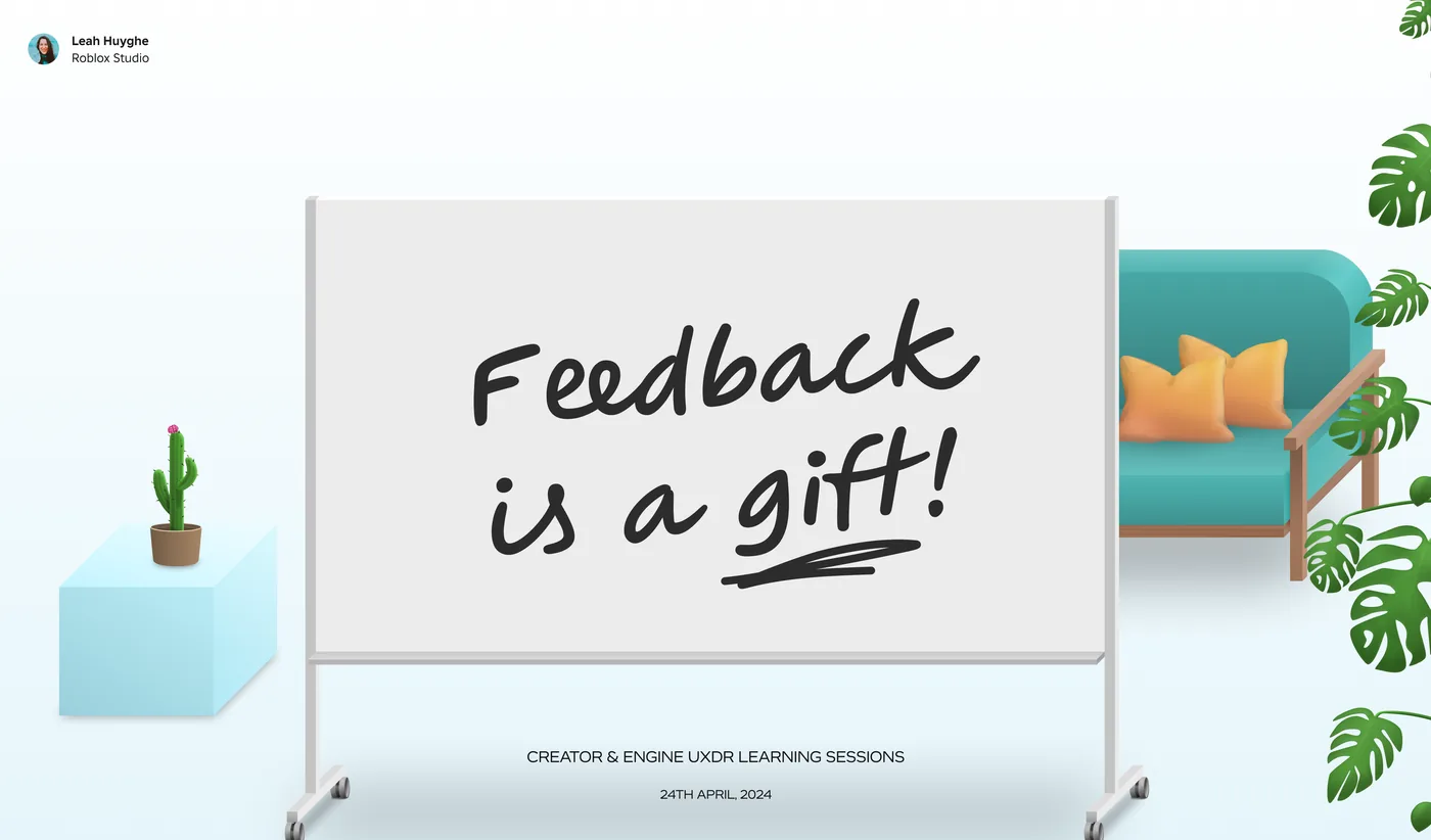
This session was designed for the Roblox Creator and Engine UXDR teams in April 2024. Feedback is the primary way through which design culture stays honest, iterative, and high-quality. Without it, designers work in a vacuum and teams drift apart. The session covered why we need to be generous with feedback, what happens during a feedback exchange, and cultural considerations around giving and receiving it well.
Feedback is our mirror. Designing in isolation leaves us dependent on our own imagination to assess quality — which isn't enough. Feedback keeps us proactive, surfaces ideas and fixes we've overlooked, and motivates us to keep sharing work. It enforces trust: a positive feedback exchange signals to the giver that their perspective is valued, and opens the door for them to seek feedback in return.
Feedback lands somewhere along a spectrum. At one end: blurry feedback — too vague, too indirect, too focused on managing the other person's emotions. Downgrader language like "kind of," "sort of," "maybe." Hard to decipher, easy to ignore.
At the other end: harsh feedback — direct to the point of being inflammatory, micro-managey, amplifier language like "totally" and "completely." The relationship takes damage even if the feedback was accurate.
The sweet spot is middle-right: clear and concise, but not inflammatory. It names what happened, explains why it matters, and invites a response.
Start with a short question. It's a pacing tool — it lets the other person know feedback is coming, and gives the amygdala a moment to register context rather than threat. "Do you have 5 minutes to debrief?" or "I have some ideas — are you open to hearing them?"
Name exactly what you observed. Cut blur words — "you could be more proactive" becomes "I needed that email by noon." Specificity tells the person precisely what to increase or reduce, rather than leaving them guessing.
Explain how the behavior affected you or the work. "I was blocked" or "I understood the concept quicker" — impact is what transforms observation into something the other person can actually act on.
Wrap with a question: "How do you see it?" or "What are your thoughts?" This creates commitment rather than compliance — a joint problem-solving situation rather than a one-directional directive.
Stay present until the person is done. Don't design in Figma, side-chat in Slack, or multitask through the conversation. The behavior signals whether their input is actually valued.
Acknowledge what it takes for someone to give feedback in the first place — the courage required to initiate a potentially uncomfortable conversation. If it landed with emotional weight, ask yourself why.
Once the feedback has been implemented, tell them. If it was behavioral, set an agreed-upon check-in period so the giver can see whether their feedback was adopted. Closing the loop builds trust.